MARTHA STEWART LIVING
Demonstrating how research shaped an American visual language
The early phase of this work took place within a magazine ecosystem that defined how American domestic life could look and feel on the page. From founding roles at Martha Stewart Baby and Martha Stewart Kids to leading book design and creative direction for the parent publication, Living, the focus was always the same: translating complex subjects into visual systems that informed, inspired, and endured.
A research ethos
That environment drew inspiration from the documentary rigor of classic field publications such as National Geographic, the kind that sent writers and photographers into the world for months to record a single story with precision and beauty. The result was a culture shaped by immersion and evidence, rooted in the belief that deep study creates more meaningful outcomes than surface observation.
Methodology in practice
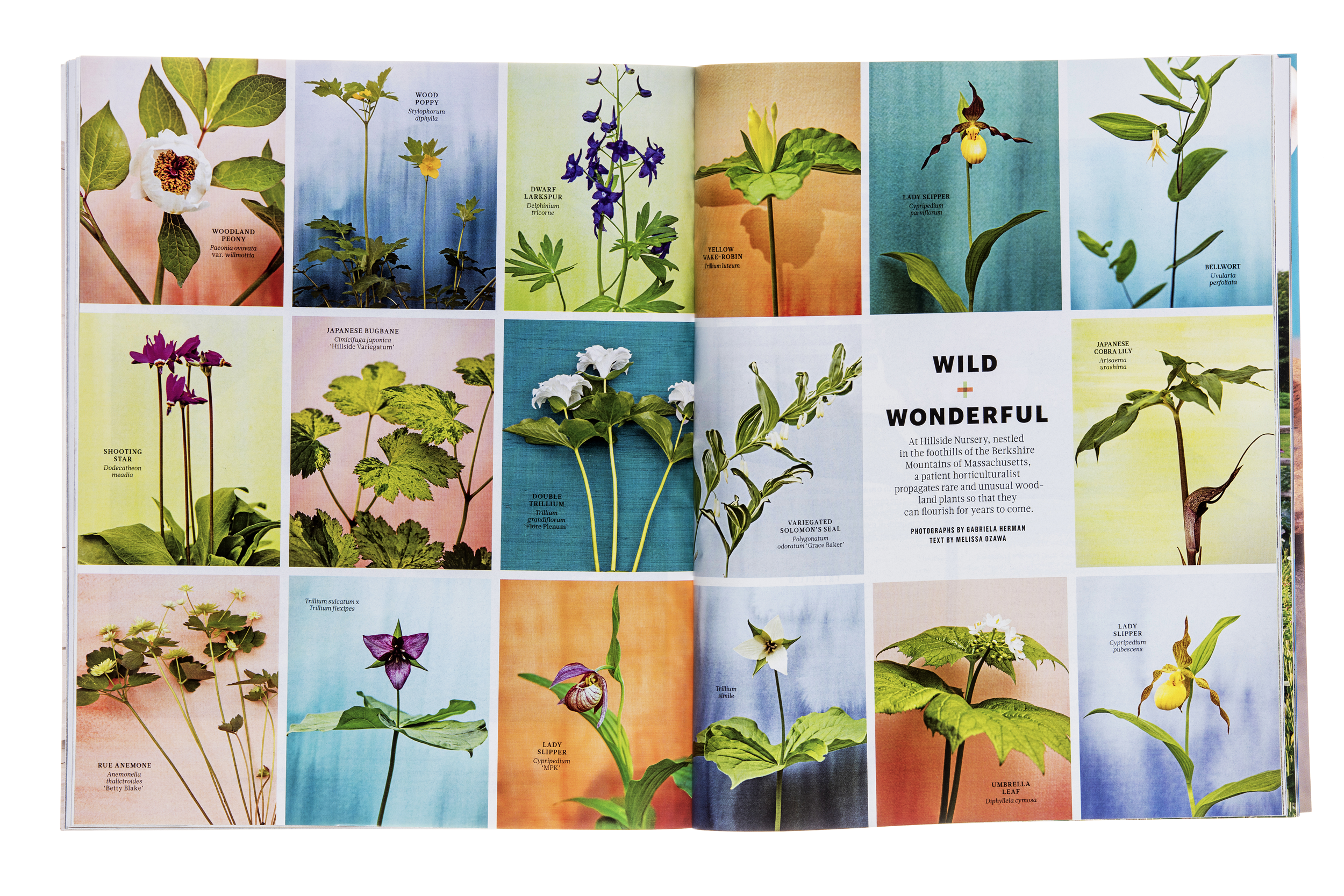
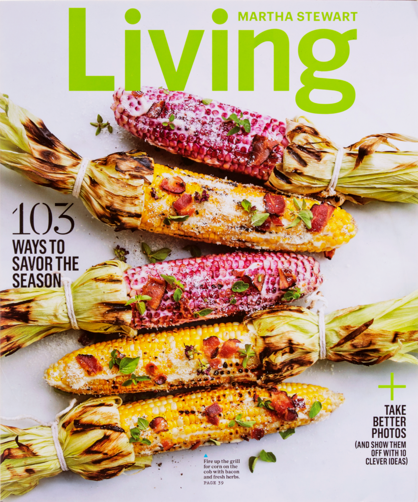
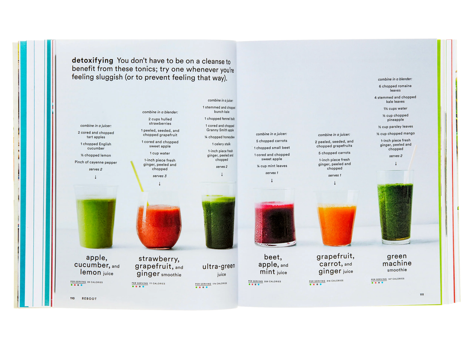
Every project began with research. Whether designing a cover or art directing a twelve-page feature on heritage apple varieties, the approach mirrored that of a journalist: understand fully before designing.
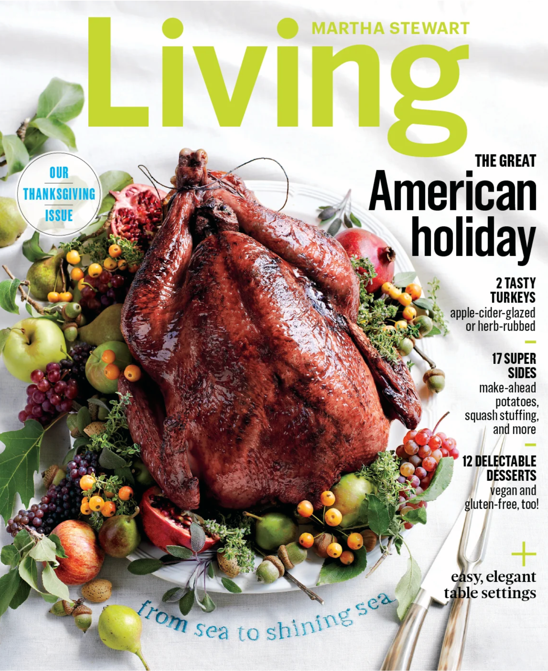
A Thanksgiving feature, for instance, required more than attractive food styling. It demanded an understanding of which turkeys photograph best, how ingredient availability varies by region, which craft techniques home cooks could realistically execute, and even how color reproduction behaves on press.
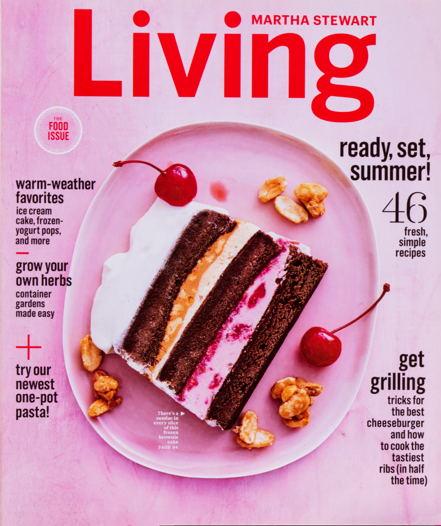
Cover as case study
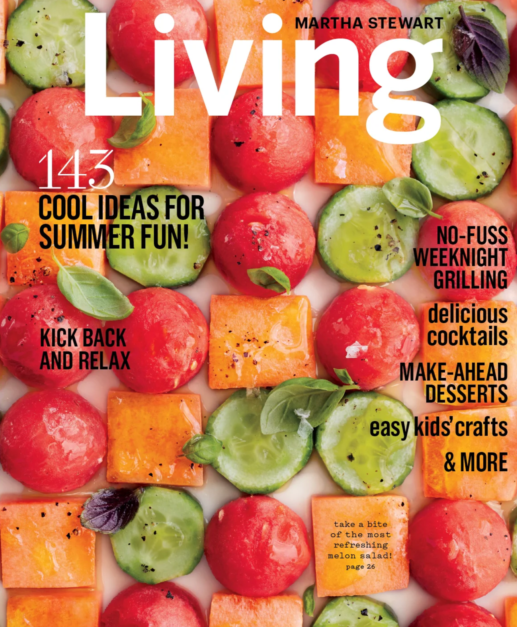
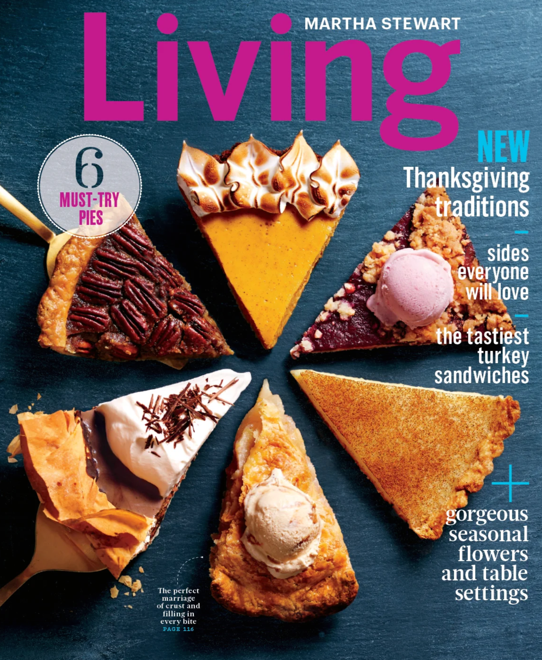
Covers became test cases for this approach. One Thanksgiving issue, themed “Sea to Shining Sea,” celebrated regional diversity rather than a single table setting. The Craft department embroidered a custom tablecloth, the Food team developed a coastal menu, and the art direction captured abundance with restraint. The result was both familiar and new—an American holiday viewed through many lenses.
From editorial to system
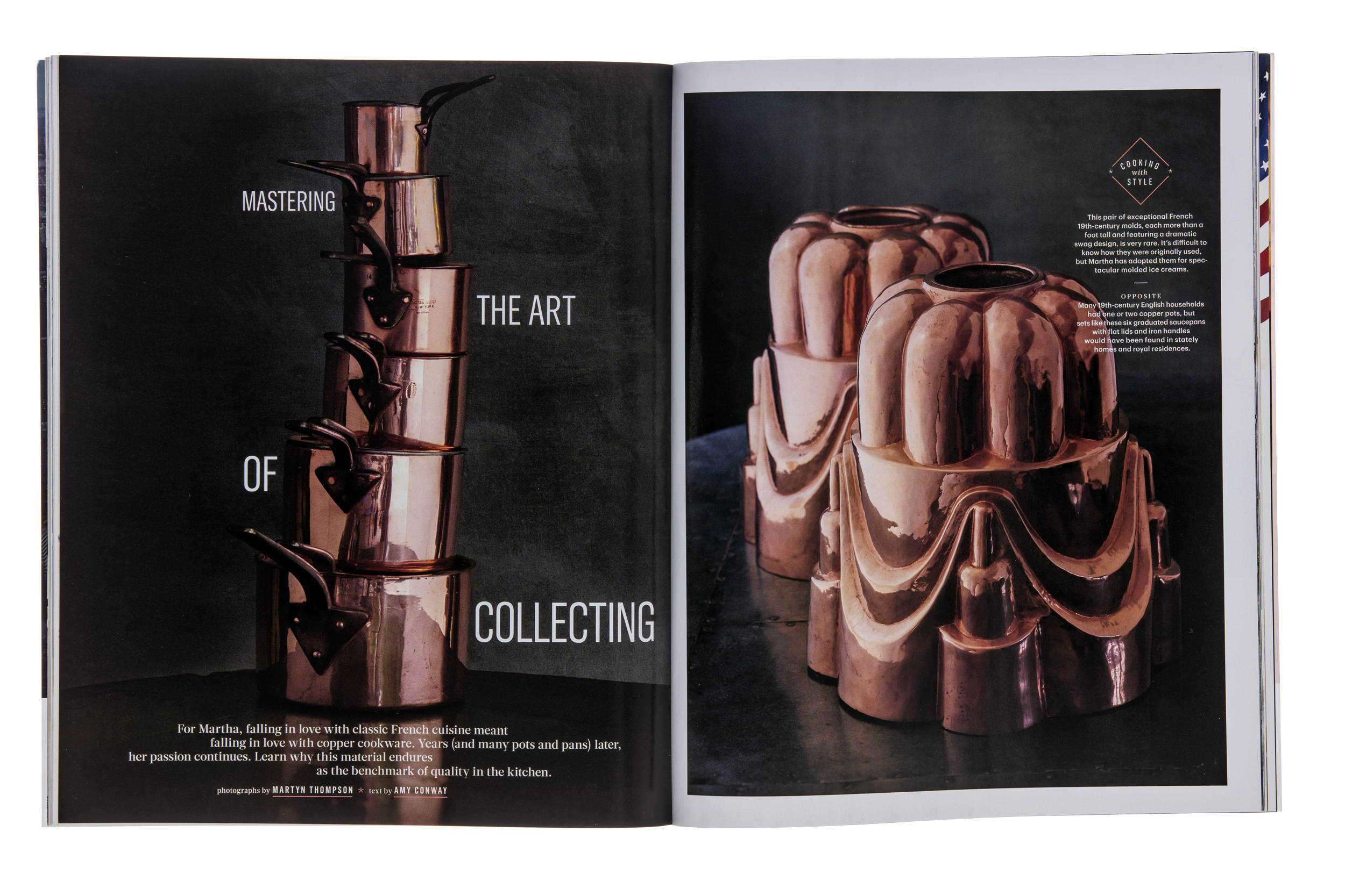
Design within that organization required fluency across disciplines: food science, horticulture, craftsmanship, photography, styling, and production. You learned fermentation from test kitchen staff, planting cycles from garden editors, traditional methods from artisans, and production constraints from press technicians. Equally important was understanding how each publication’s tone contributed to the broader brand family.
This cross-disciplinary awareness became the groundwork for later practice. Effective visual systems depend on understanding the operational realities that support them.
Expanding the practice
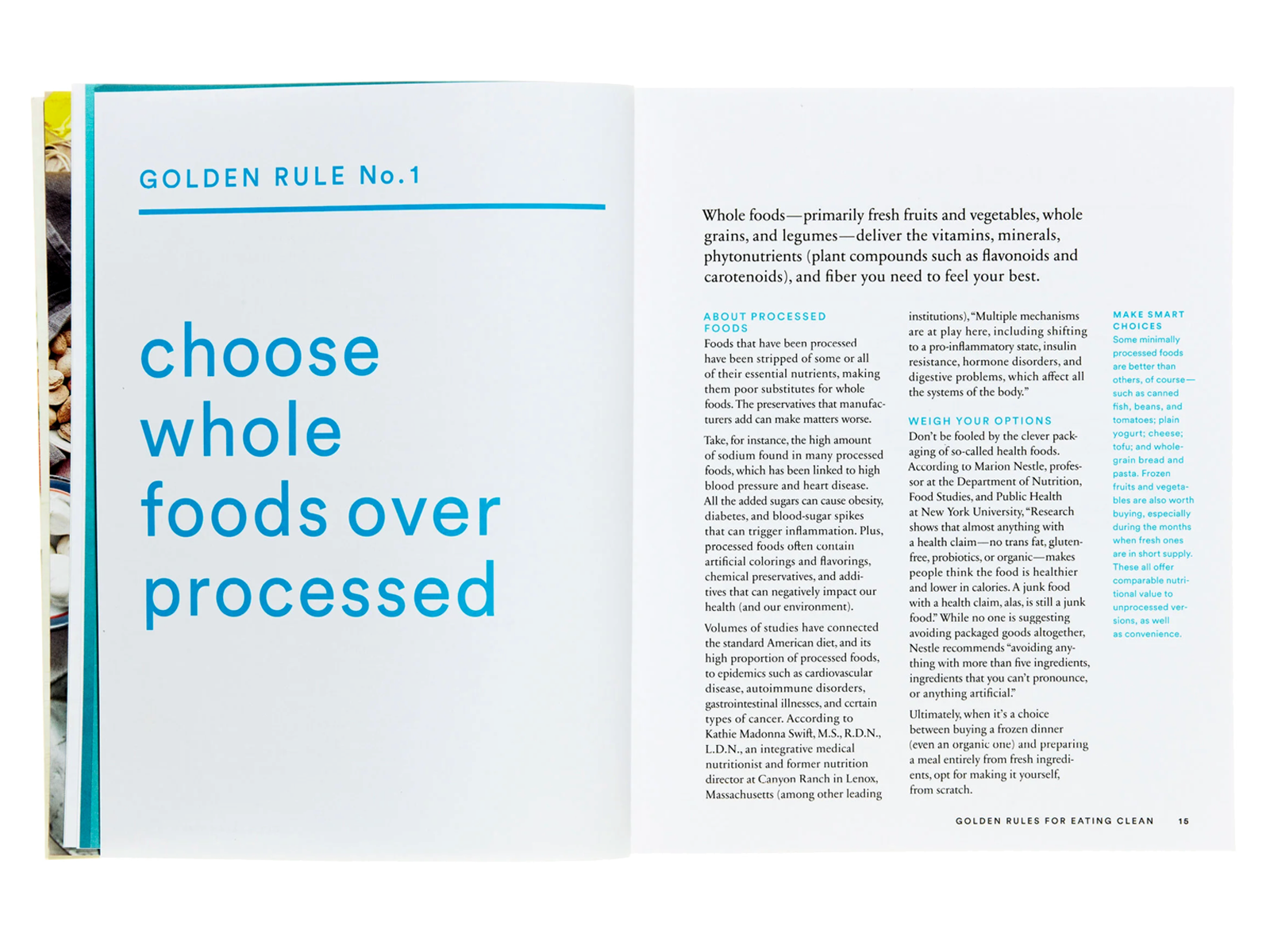
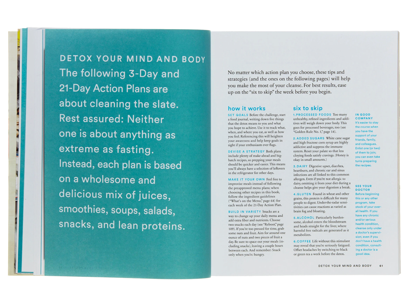
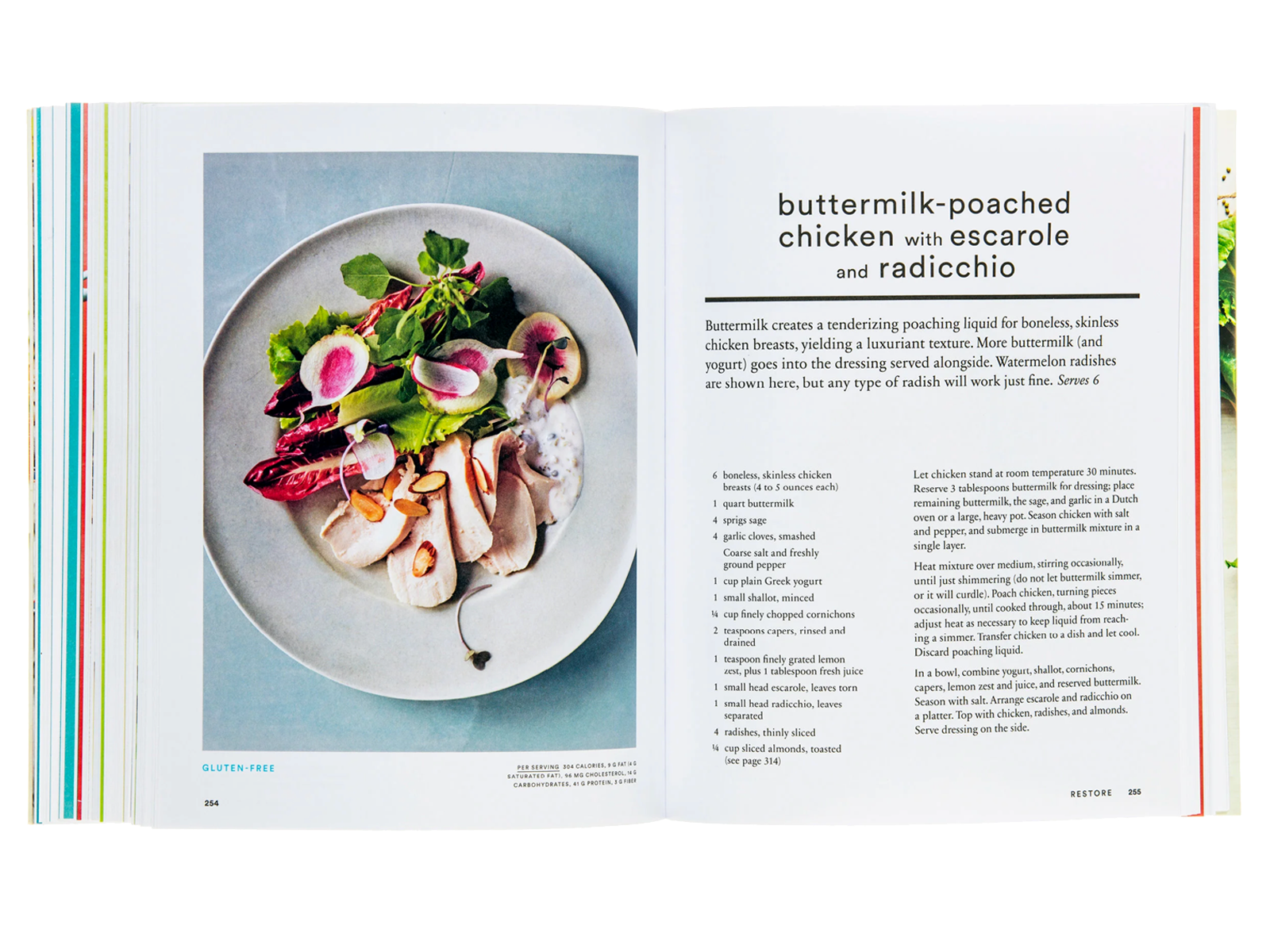
As the work expanded into book design, that same philosophy guided the creation of enduring references—cookbooks, craft guides, and manuals structured to teach as well as inspire. Each project required mastery of the material so that design decisions could enhance comprehension rather than distract from it.
What endures
The essential lesson was simple: meaningful design comes from deep understanding. You can’t build an authentic identity for a wine estate after a single visit, or train a hospitality team to speak about terroir without firsthand knowledge of the land. Visual storytelling built on shallow research rarely lasts.
The research-first process used at Field Office today, with its structured discovery phases, stakeholder interviews, and system mapping, grew from that editorial foundation. It carries forward the same investigative discipline that once defined some of America’s most influential publications.