BRICIA LOPEZ & JAVIER CABRAL
Book design as an act of cultural stewardship
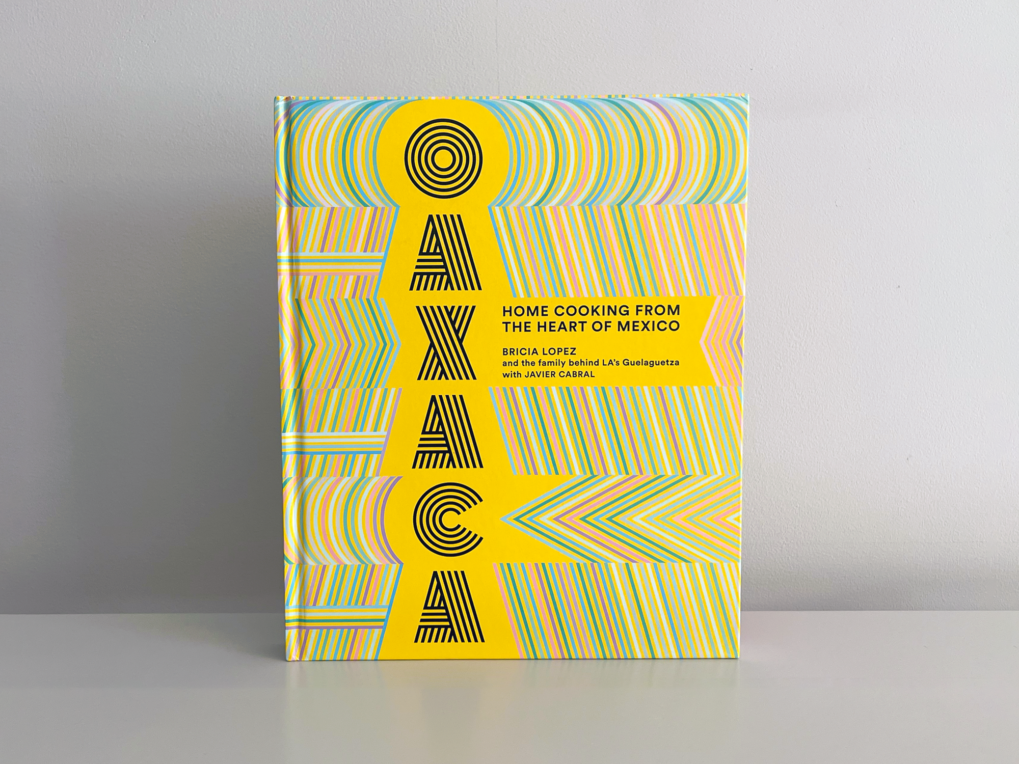
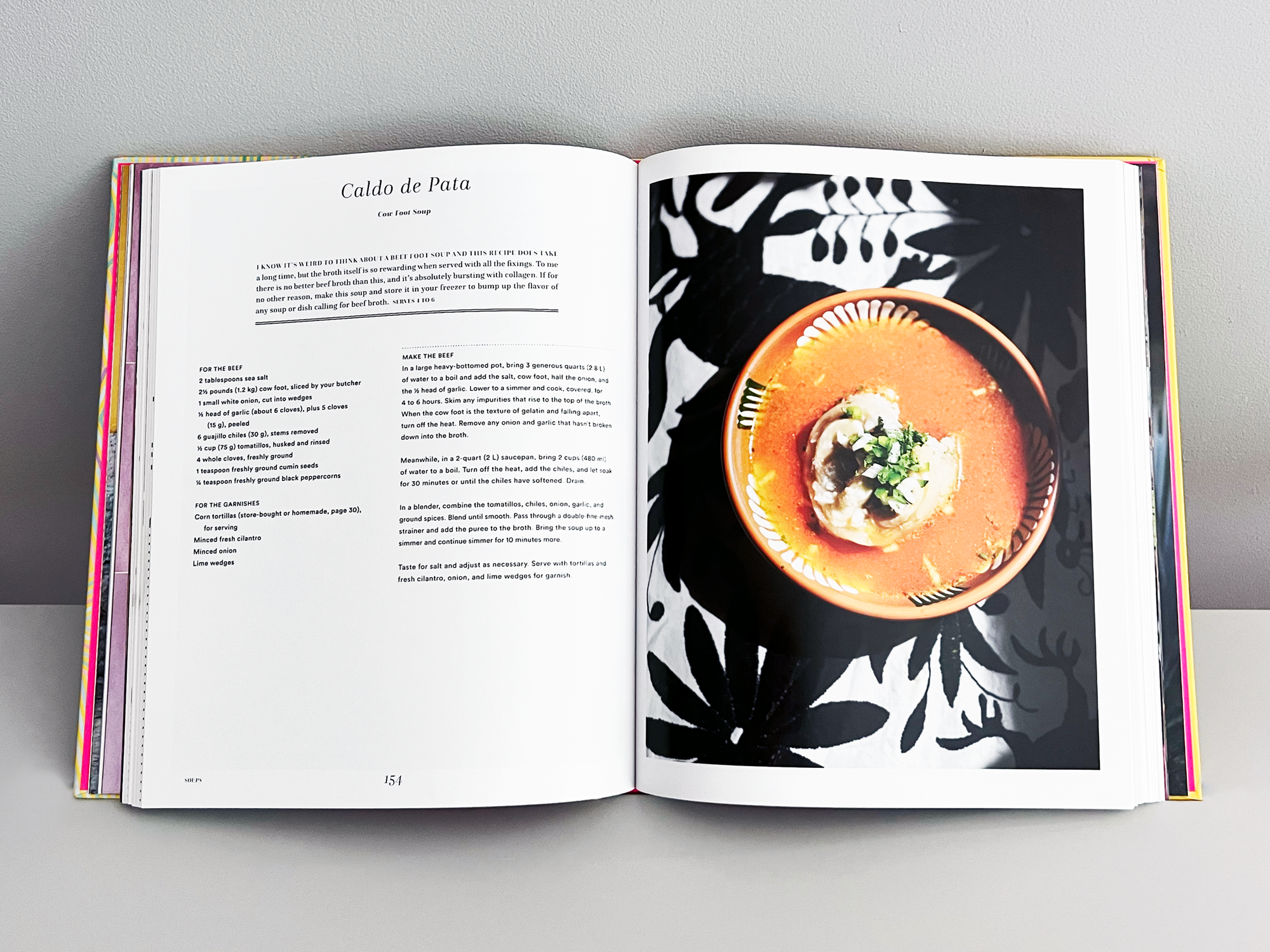
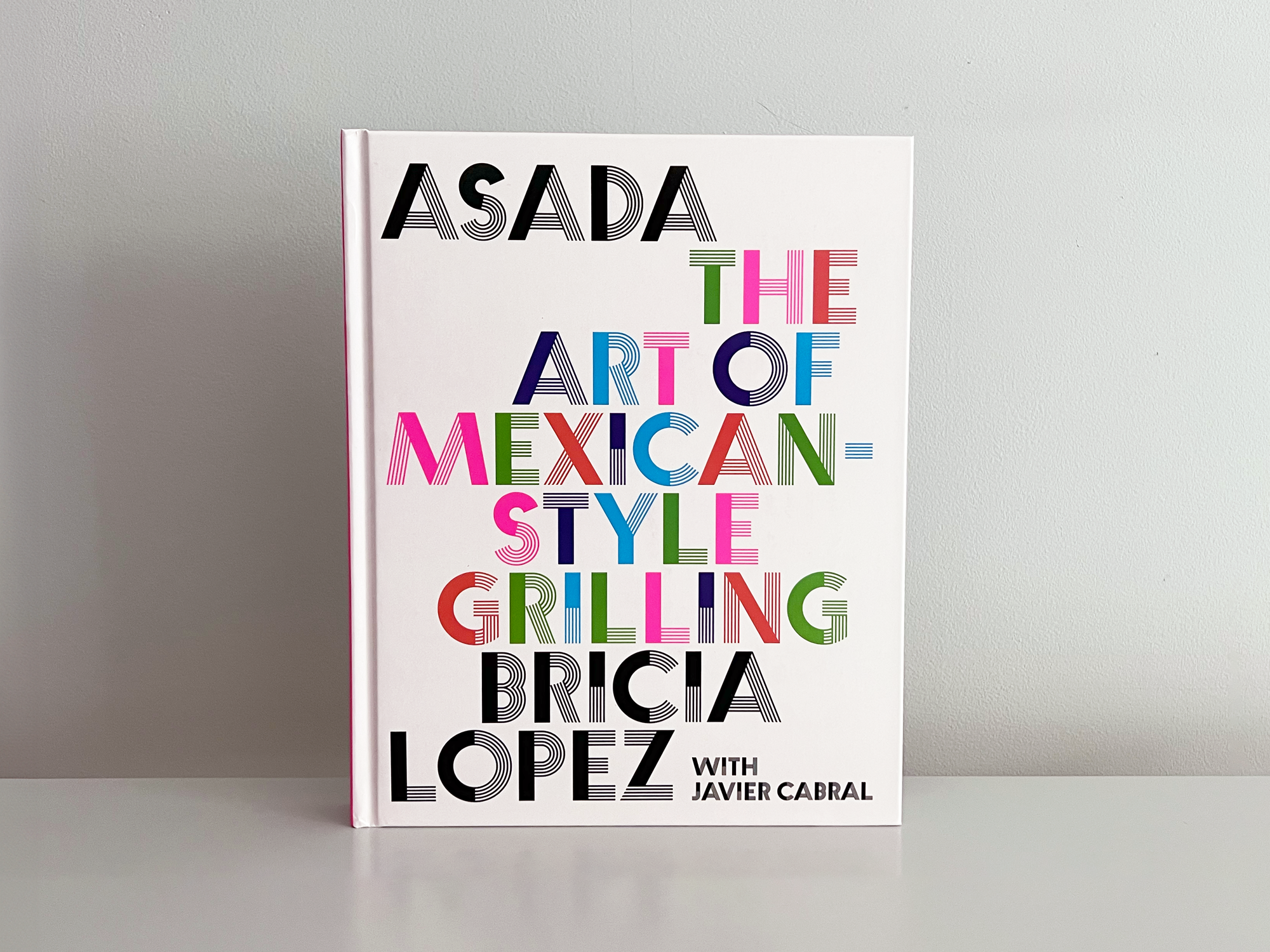
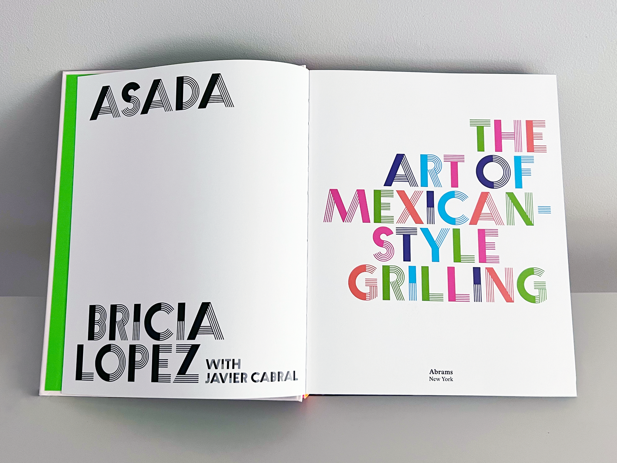
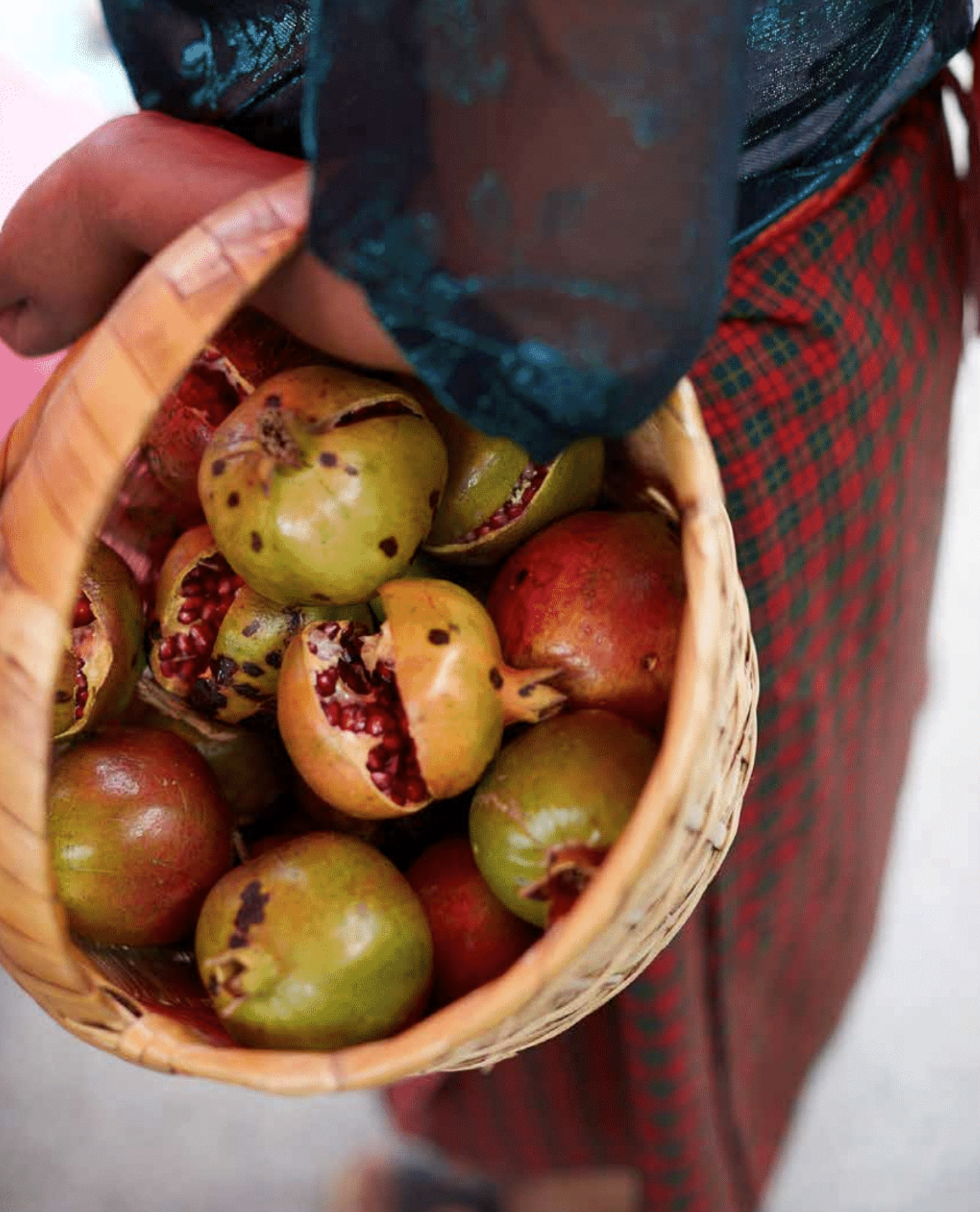
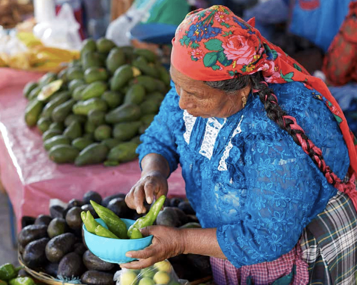
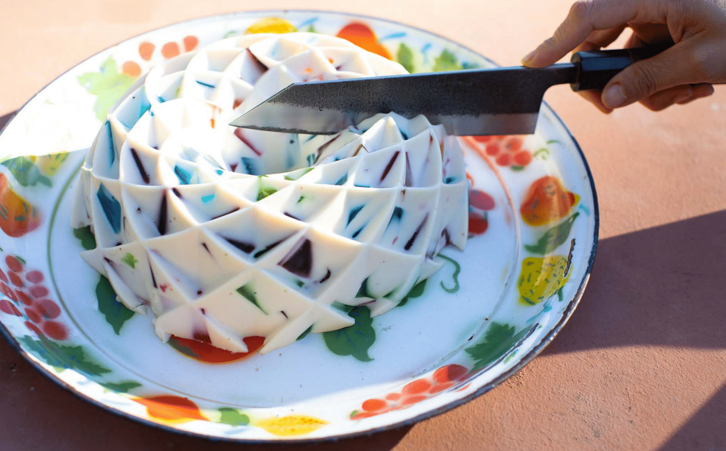
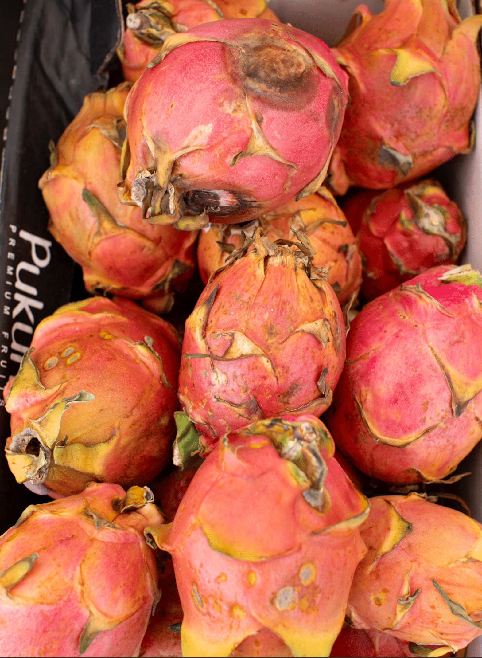
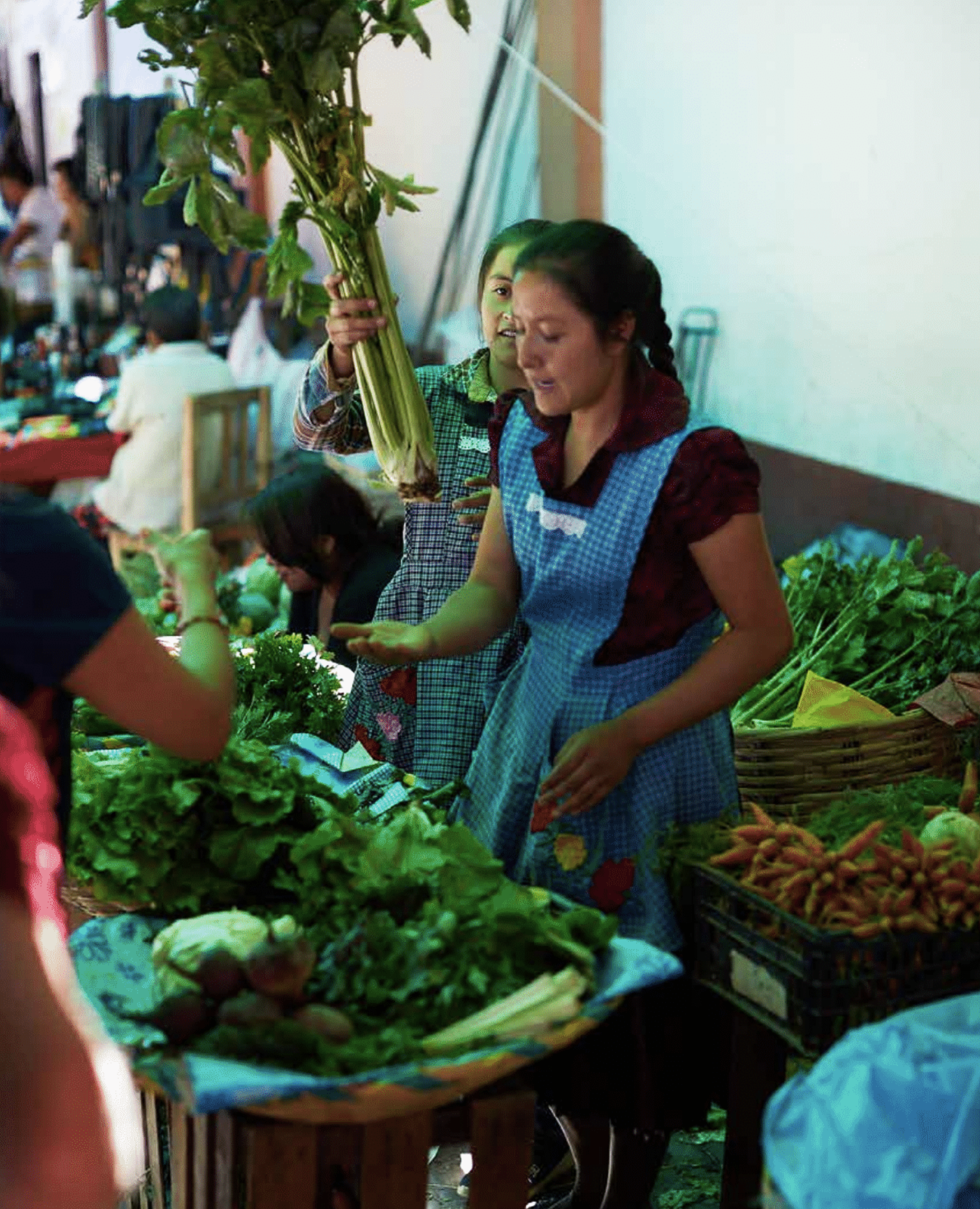
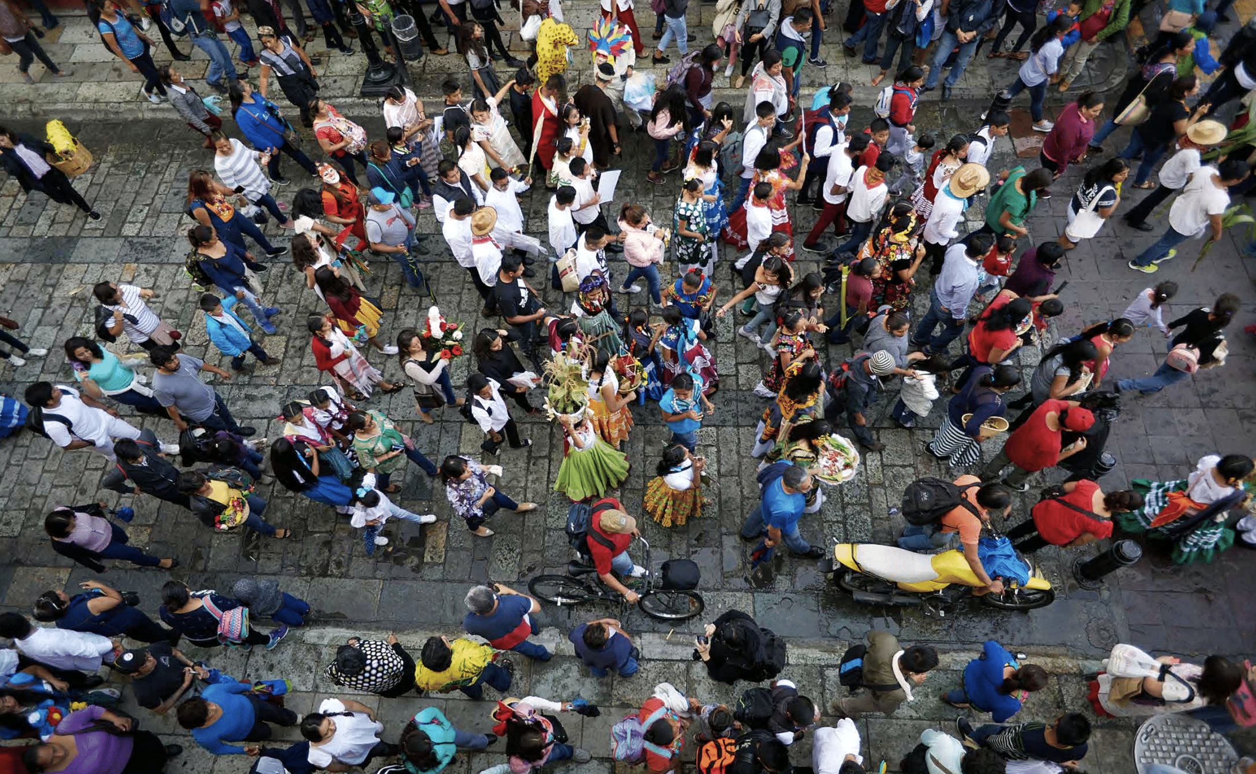
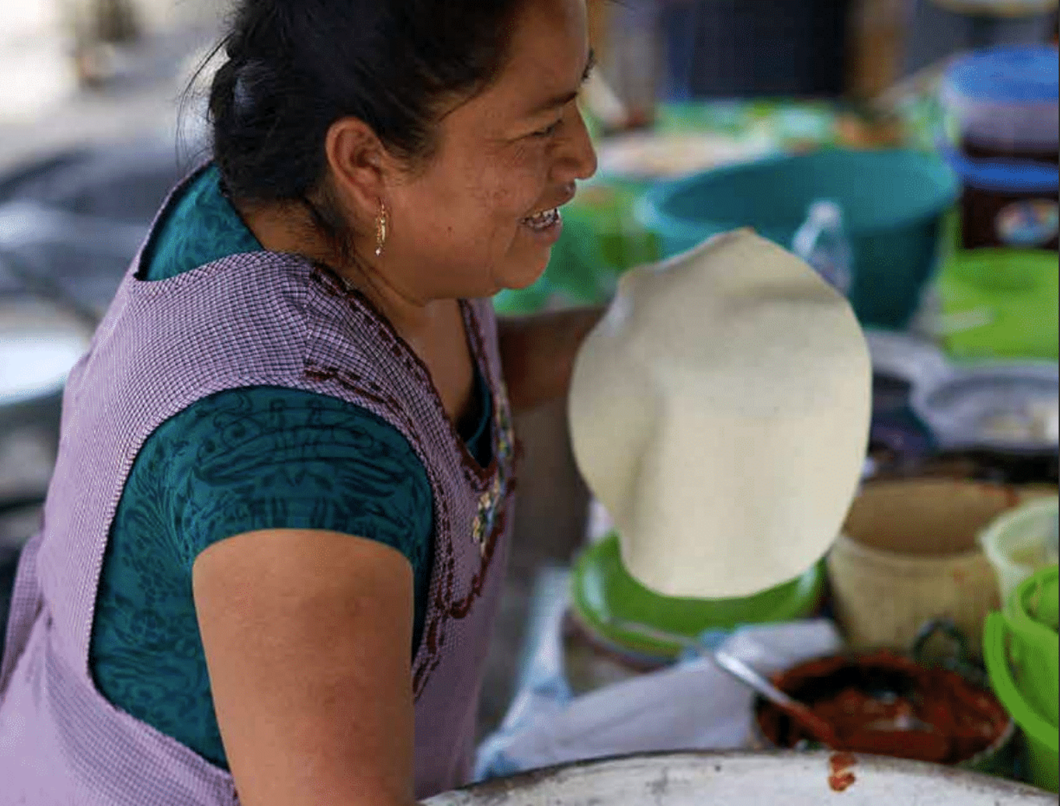
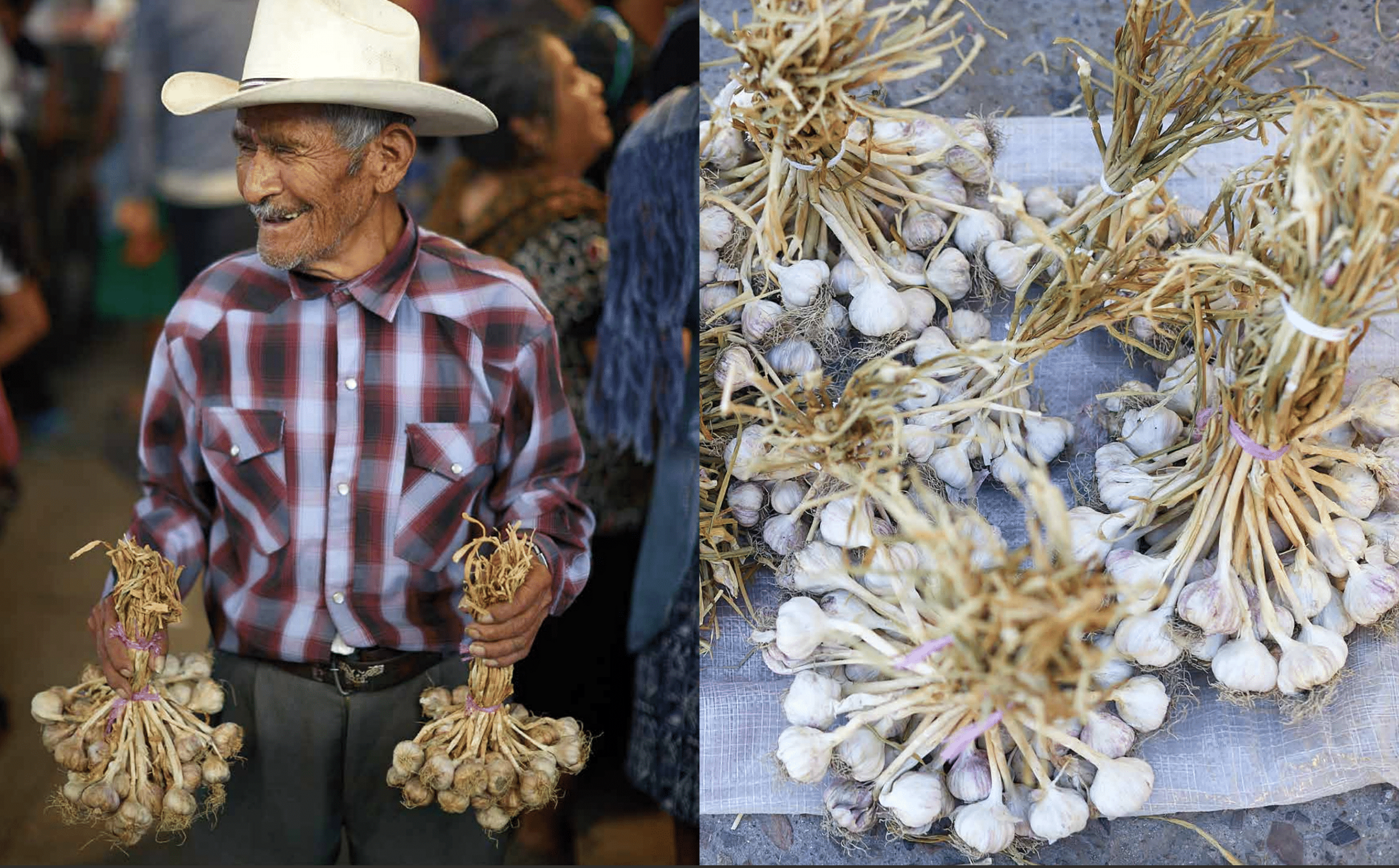
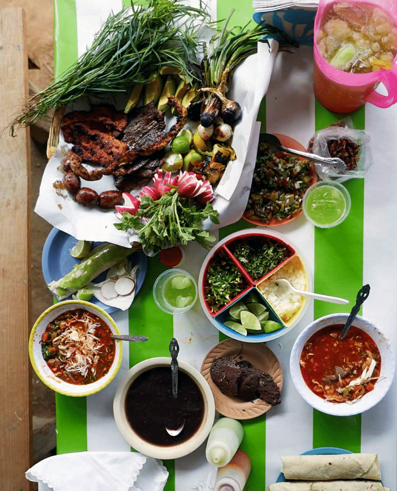
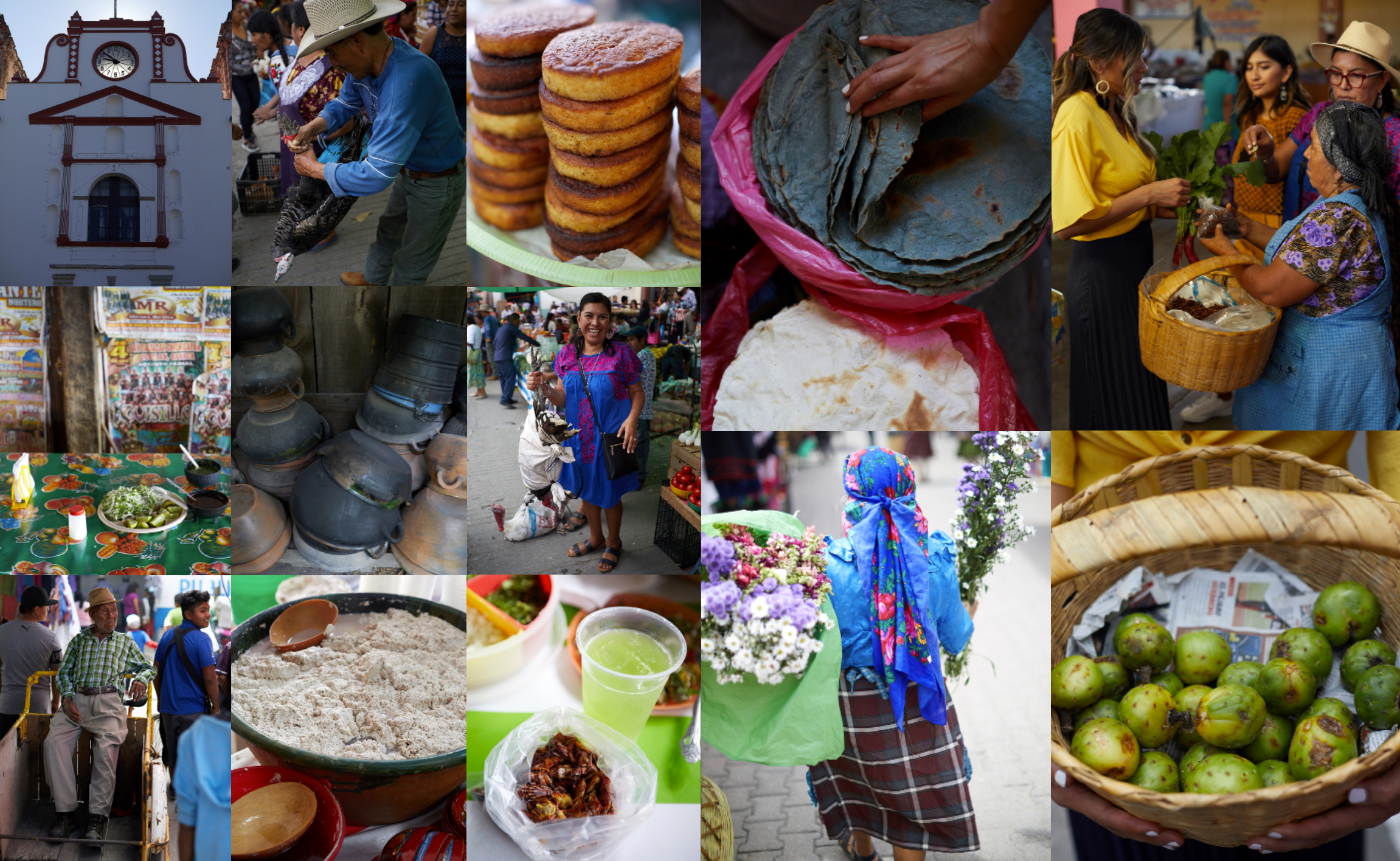
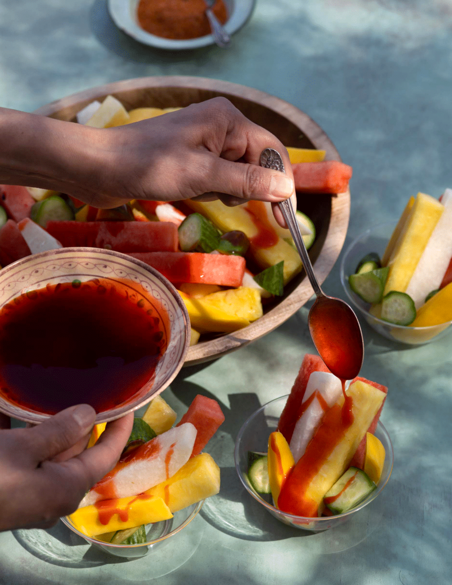
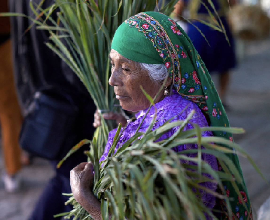
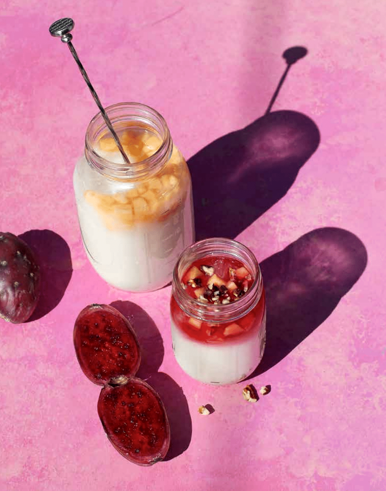
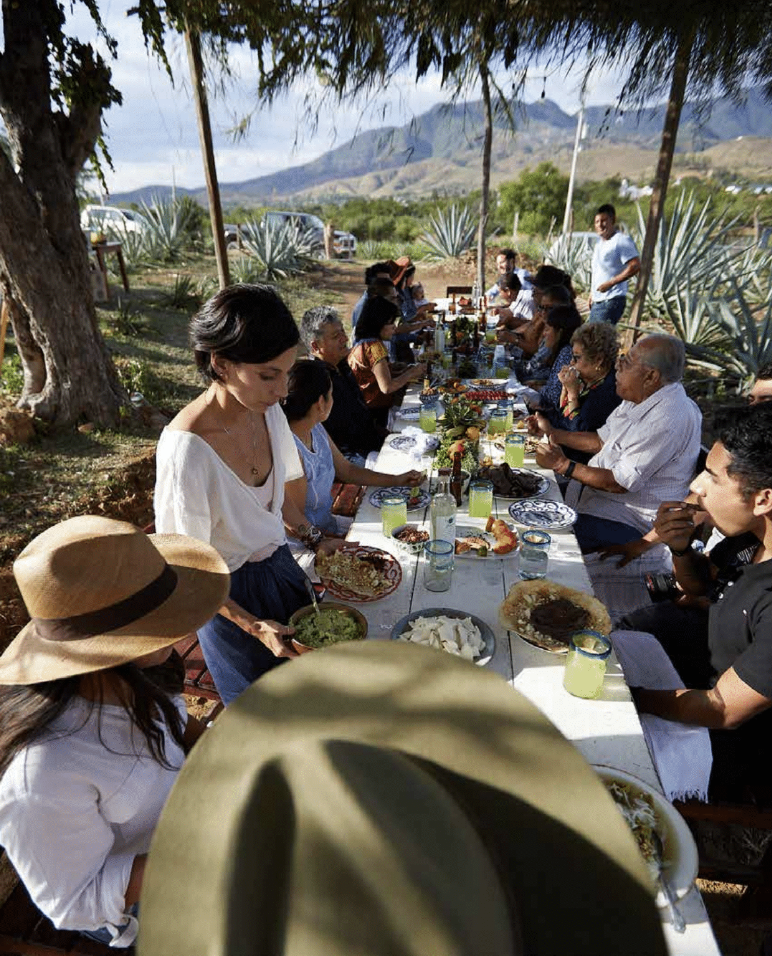
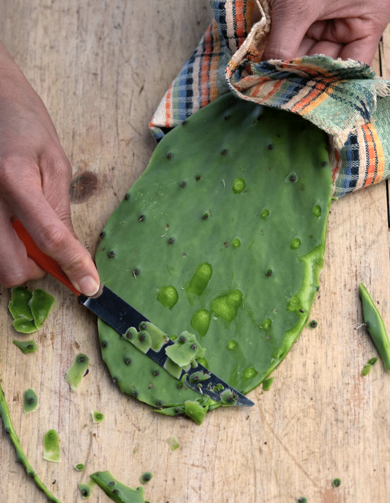
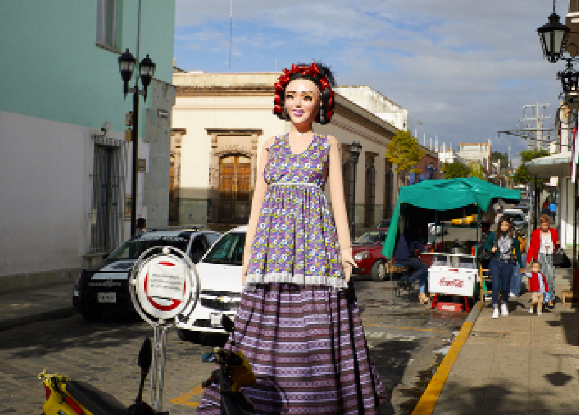
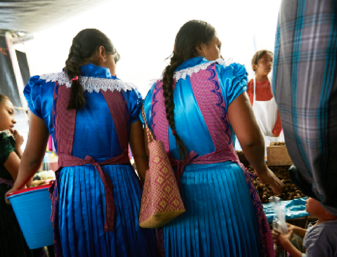
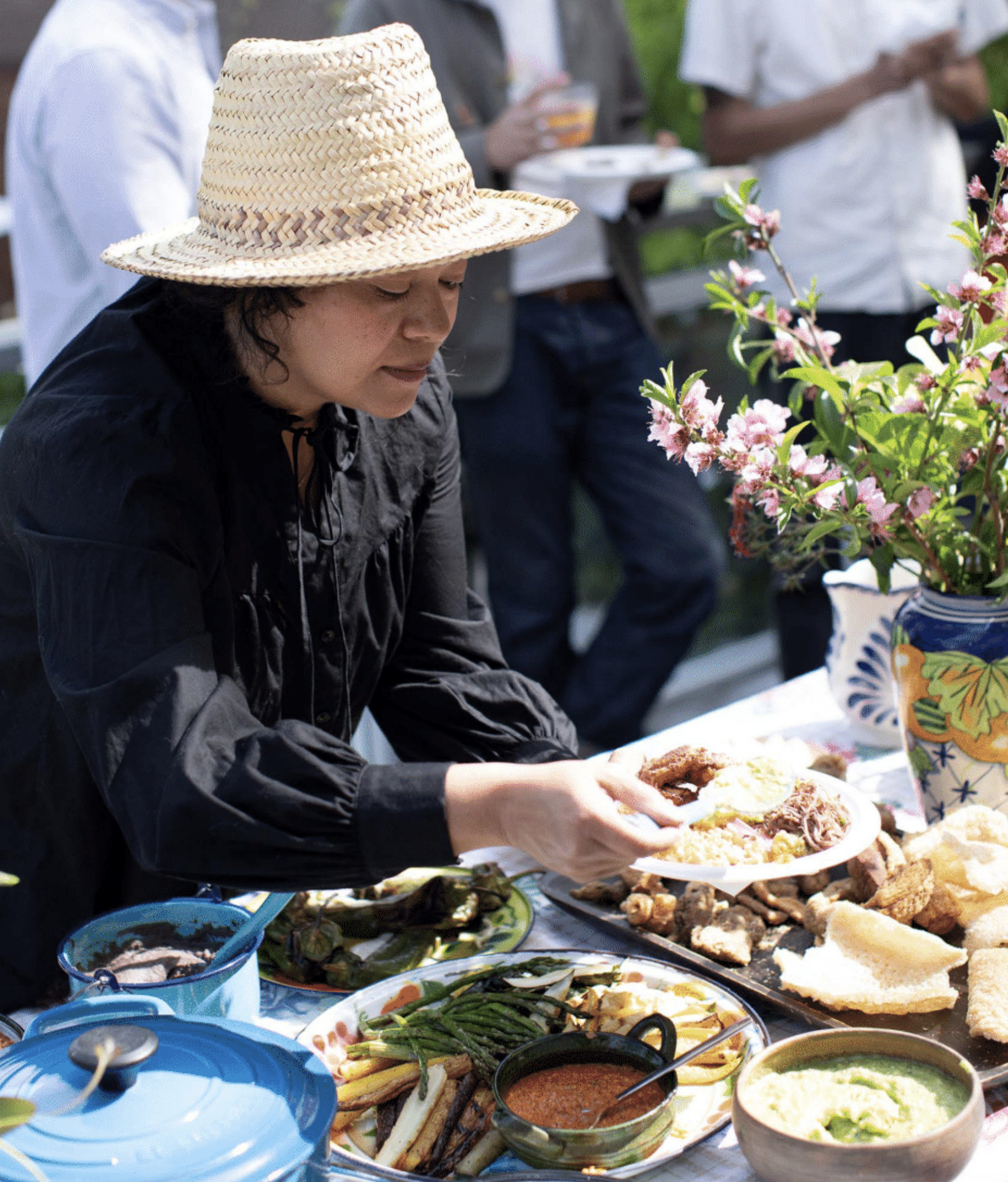
Oaxaca: Home Cooking from the Heart of Mexico and Asada: The Art of Mexican-Style Grilling, both published by Abrams and co-authored by Bricia Lopez and Javier Cabral with photography by Quentin Bacon, were more than cookbooks. They were acts of cultural preservation, documenting the agricultural knowledge and culinary traditions carried from Oaxaca to Los Angeles by immigrant communities.

Why these books mattered
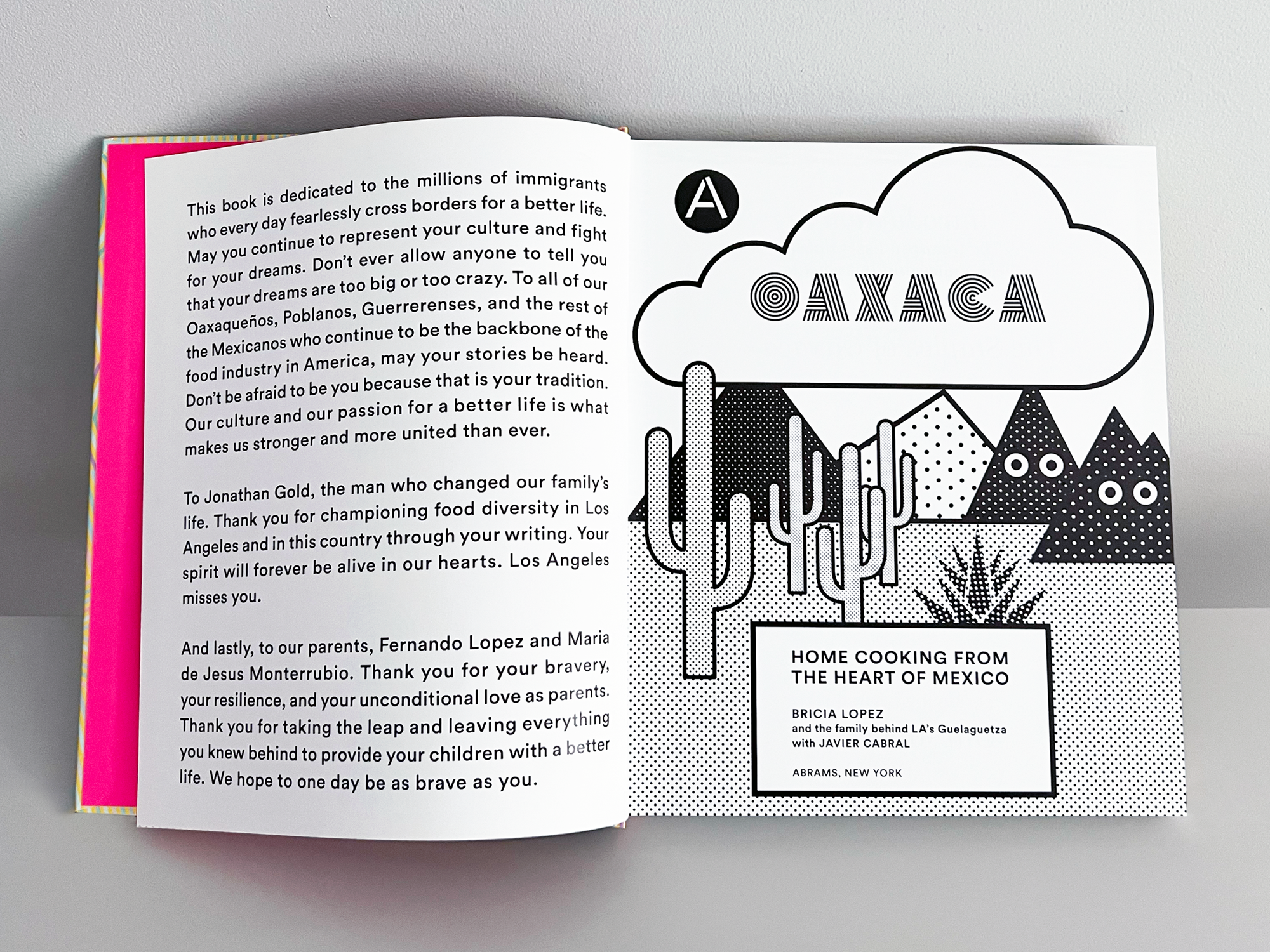
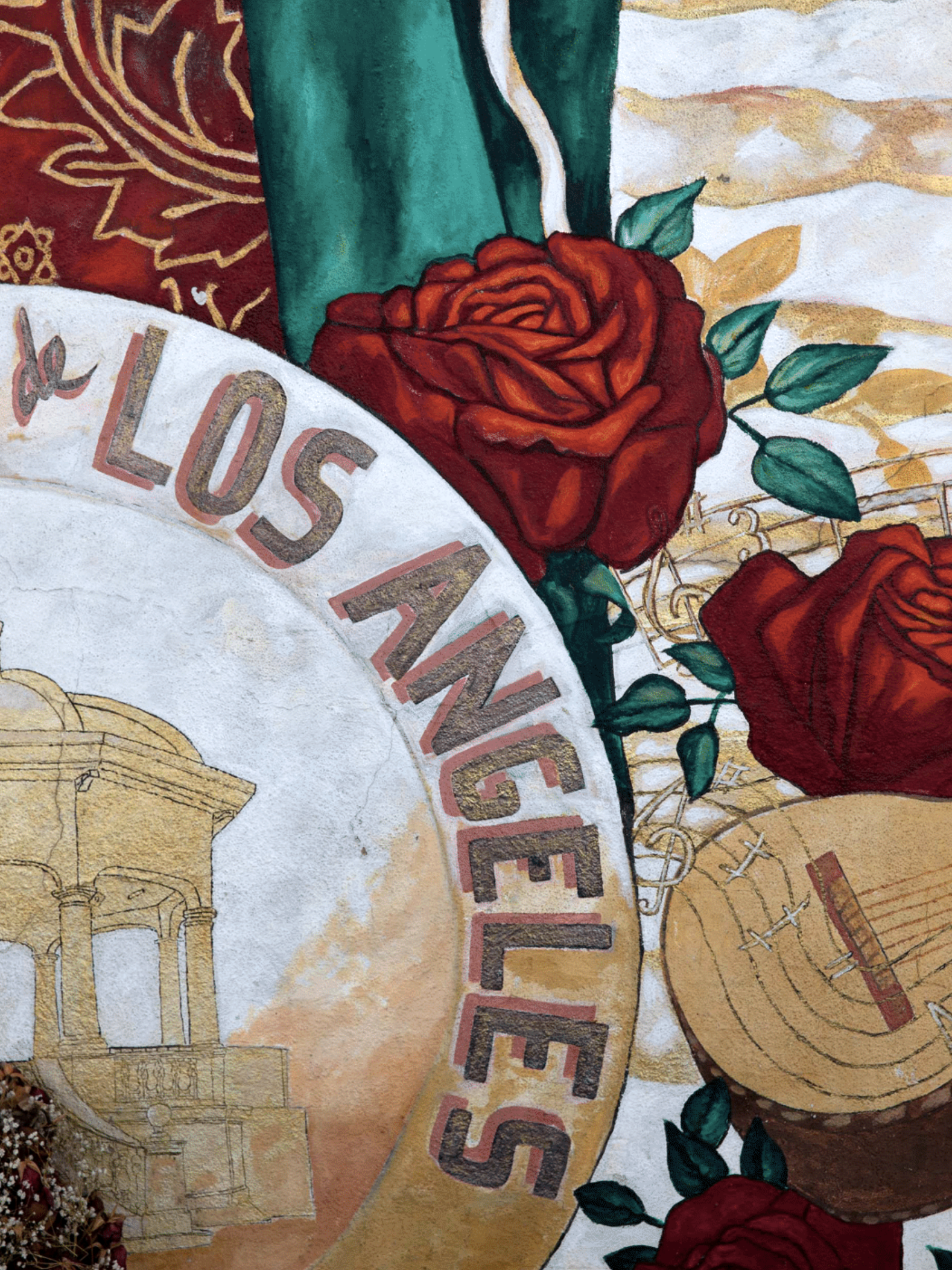
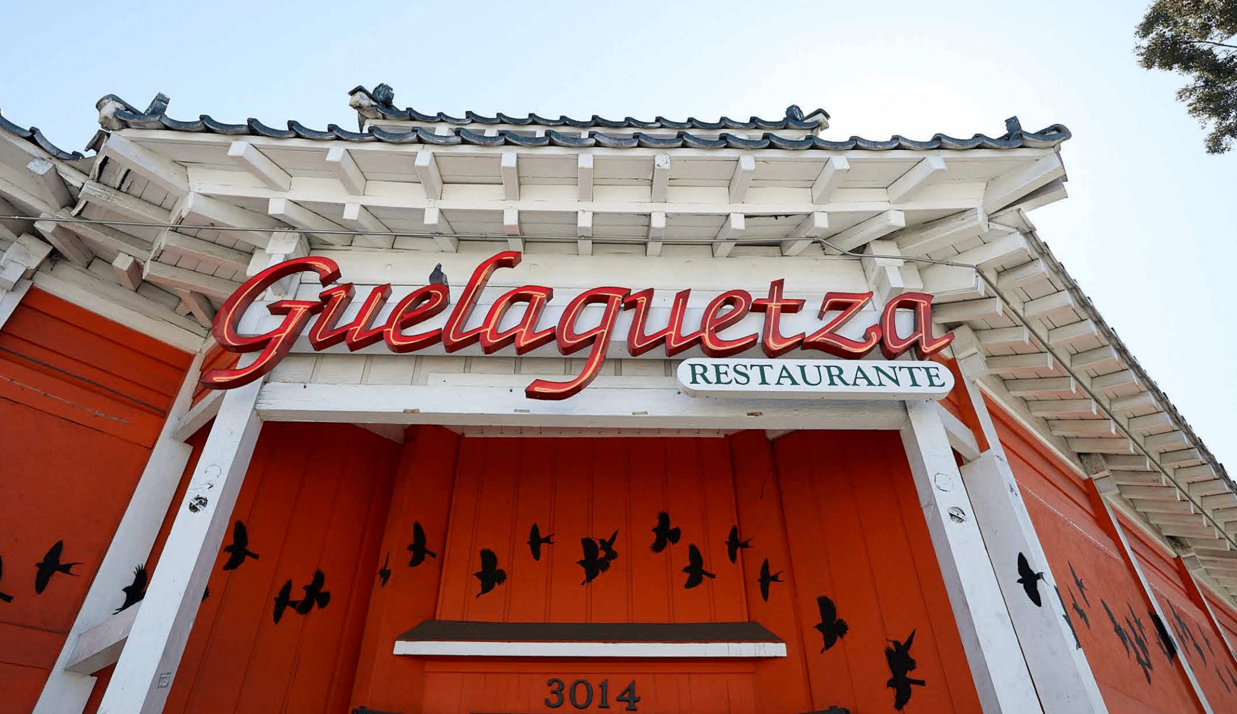
Jonathan Gold, the late Pulitzer Prize–winning Los Angeles Times critic, called Guelaguetza “the best Oaxacan restaurant in the United States.” His writing did more than review restaurants—it recognized immigrant foodways with the same seriousness once reserved for European fine dining. The dedication in Oaxaca honors that legacy, addressed to the millions of immigrants who cross borders for a better life and to Gold himself, credited with changing the Lopez family’s story by championing food diversity in Los Angeles. These books continue that work, honoring the Oaxaqueños, Poblanos, and Guerrerenses who form the backbone of American food culture.
The design challenge
How do you build visual systems that honor centuries-old traditions while remaining accessible to home cooks? The answer lay in typography that balanced heritage with immediacy.
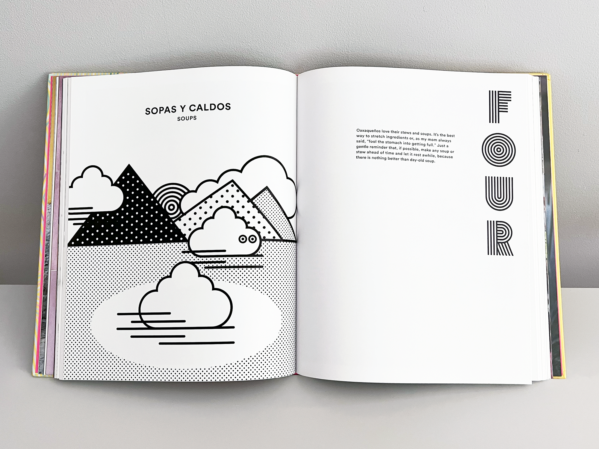
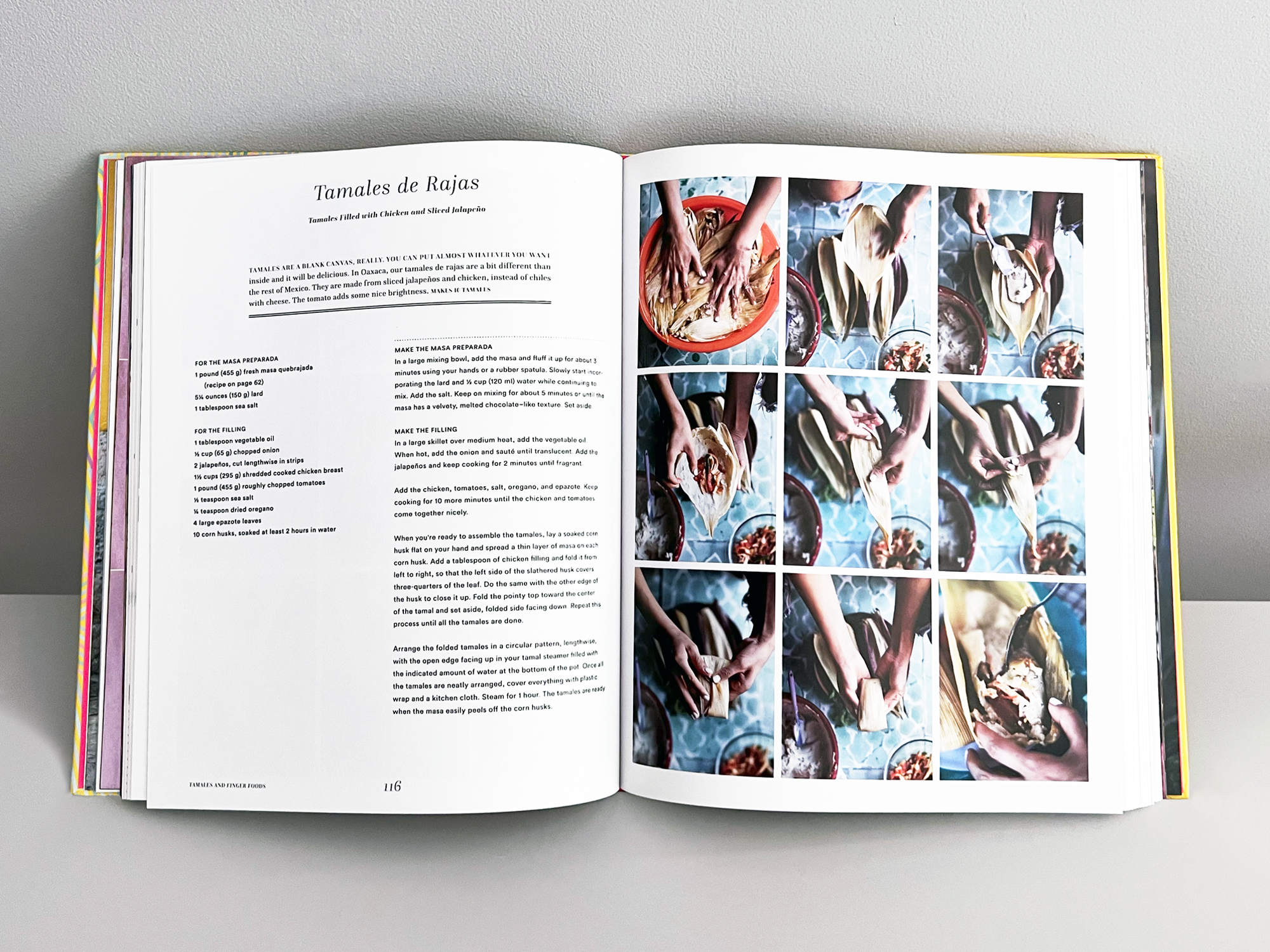
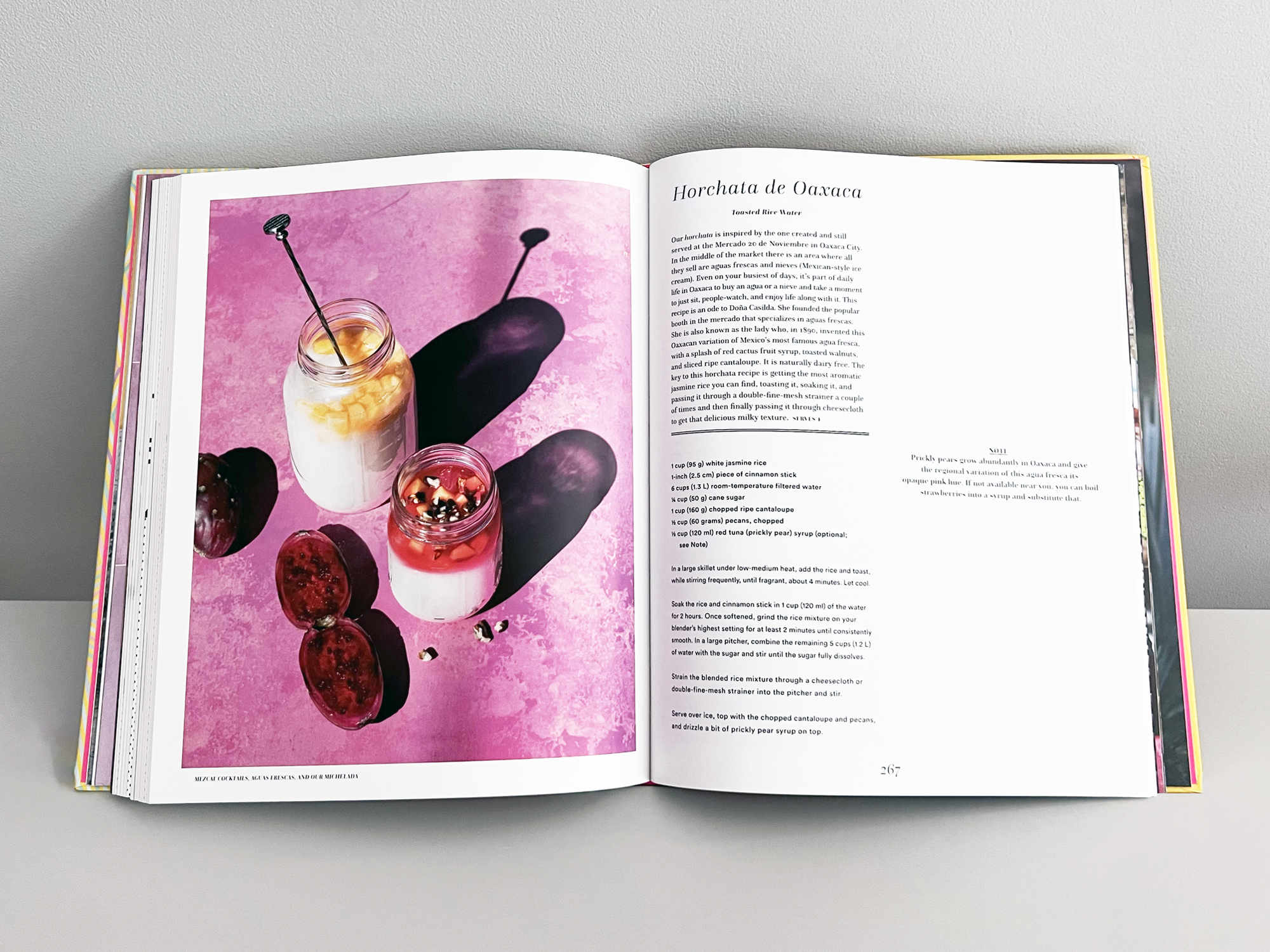
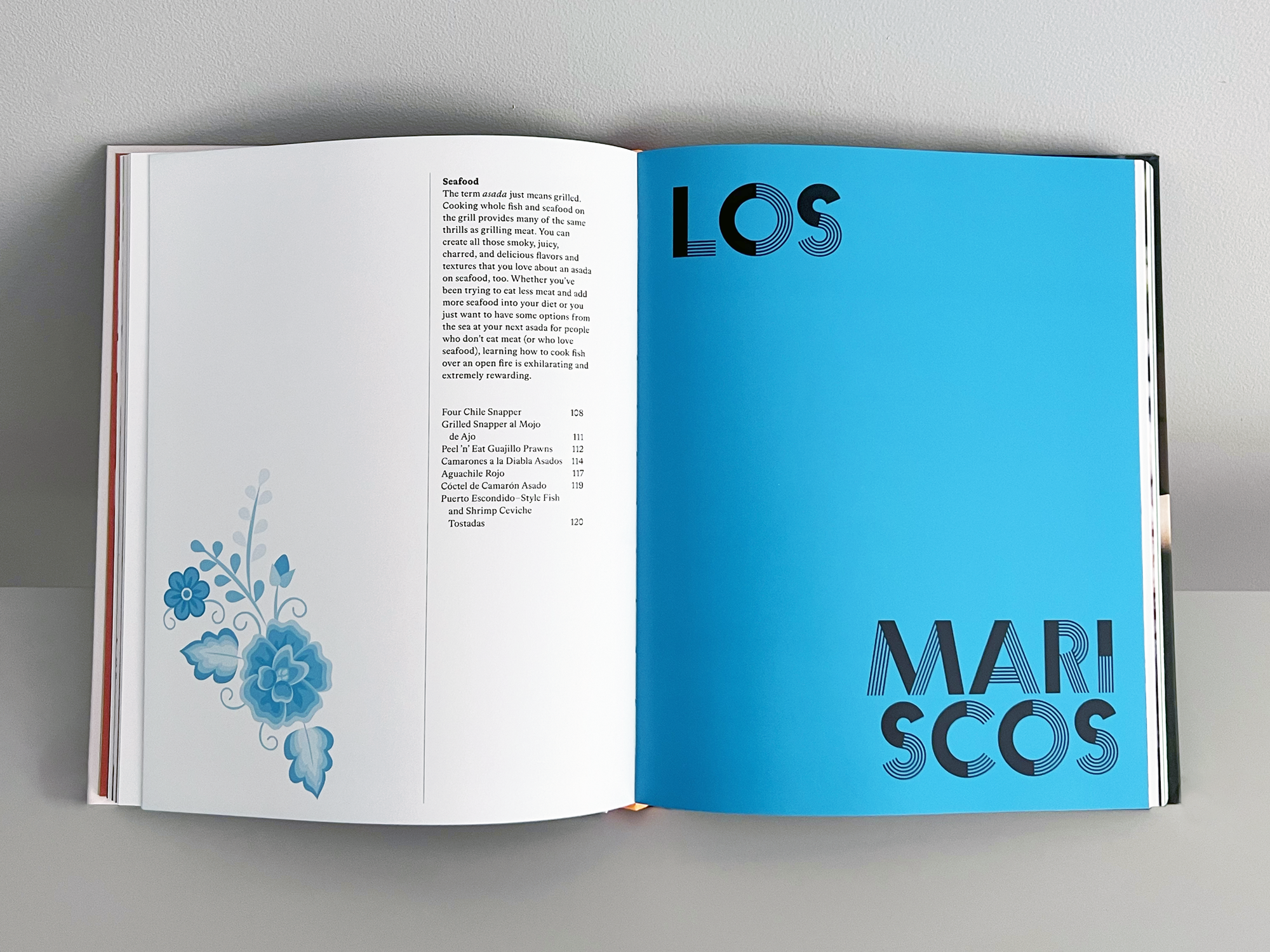
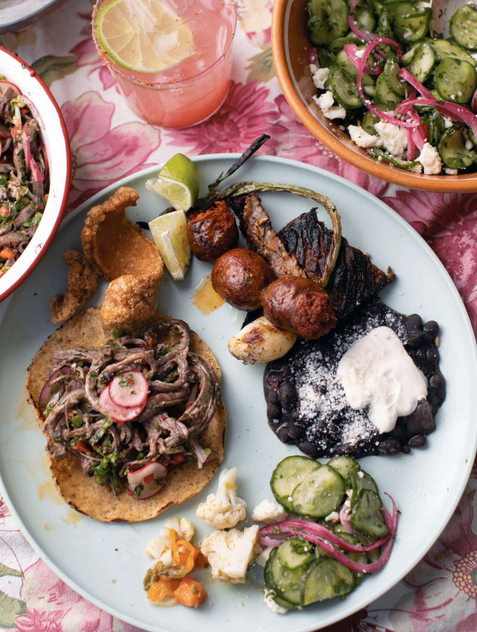
For Oaxaca, we chose the Questa by Martin Majoor. Its classical proportions give weight to a book about ancient moles, nixtamalized corn, and inherited recipes—authority without the museum tone that distances readers.
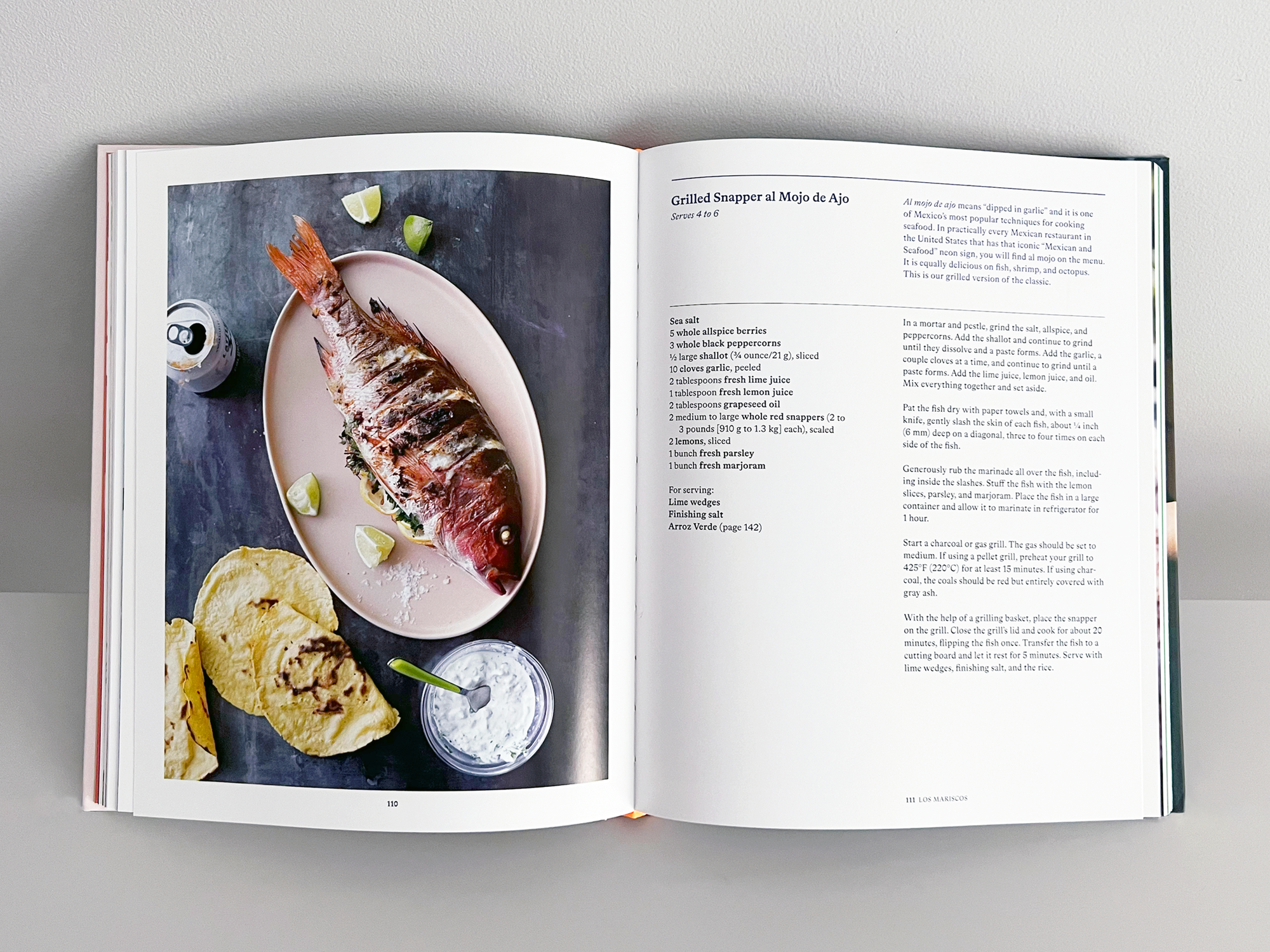
For Asada, we chose Bradford by Laurenz Brunner. Bolder and more casual, it suited a book about backyard grilling while remaining grounded in typographic structure. The typography echoed the food itself: communal, rooted in craft, alive in the present.
Color reinforced tone. Oaxaca’s palette of charred black, terracotta, and maize yellow reflected earthenware and fire. Asada’s smoky grays, chile reds, and citrus greens evoked flame, smoke, and garnish. Too referential and the books would feel archival; too modern and they’d lose their grounding. Both palettes balanced authenticity with accessibility.
What made it special
Bricia and Javier approached design the way they approach cooking: respecting ingredients, honoring tradition, knowing when to step aside. That shared trust allowed bold decisions in typography, color, and layout—all in service of the story rather than style. These projects were never about making something beautiful for its own sake. They were about honoring communities, preserving knowledge, and celebrating the immigrant experience that continually redefines American food culture.
Why this work matters to Field Office
These books document immigrant terroir—the knowledge of land, seed, and craft carried across borders. Like the revival of centuries-old chinampas in Mexico City, these authors preserve Oaxacan traditions in Los Angeles. Both are acts of cultural stewardship, keeping ancestral knowledge alive through food and place.
Editorial design and Field Office’s work share the same foundation: cultural understanding, cross-disciplinary collaboration, and the ability to translate complexity into clarity. You can’t design a book about Oaxacan moles without understanding the seven regions, the indigenous communities, the ingredients, and the techniques—just as you can’t build a hotel brand without documenting the working harbor, the tides, or the maritime traditions that shape daily life. In both cases, what looks like local detail is actually competitive advantage. The research-first method applies equally whether you are designing a cookbook or defining a property’s terroir. Both require depth over surface. Both endure because of it.