THE NEST RESTAURANT GROUP
Building scalable brand systems
From the beginning, The Nest was envisioned as a scalable restaurant brand that could expand without losing its neighborhood warmth. Inspired by historic establishments such as Turin’s Tre Galline and Zürich’s Kindli, the challenge was to express quiet excellence and approachable sophistication through a flexible identity system. The goal was to capture genuine craftsmanship and playful confidence in a form that could be replicated without becoming corporate or overly polished.

Philosophy
Sustainability and design share a common foundation. Ground eggshells become fertilizer for community gardens, reusable glass jars carry takeout meals, and compostable packaging replaces plastic. These are not marketing gestures but expressions of the brand’s underlying value system.
Every component, from illustration to supply chain, communicates the same belief: craftsmanship, sustainability, and community are inseparable.
What this taught
Developing The Nest reinforced a key principle at the center of our practice: scalable systems succeed only when built on authentic process. A brand can grow sustainably only if its design, production, and operations remain connected to its origin story.
The Nest showed that research and craft are not opposing forces but complementary ones. When every decision reflects genuine understanding, scale enhances character rather than erasing it.
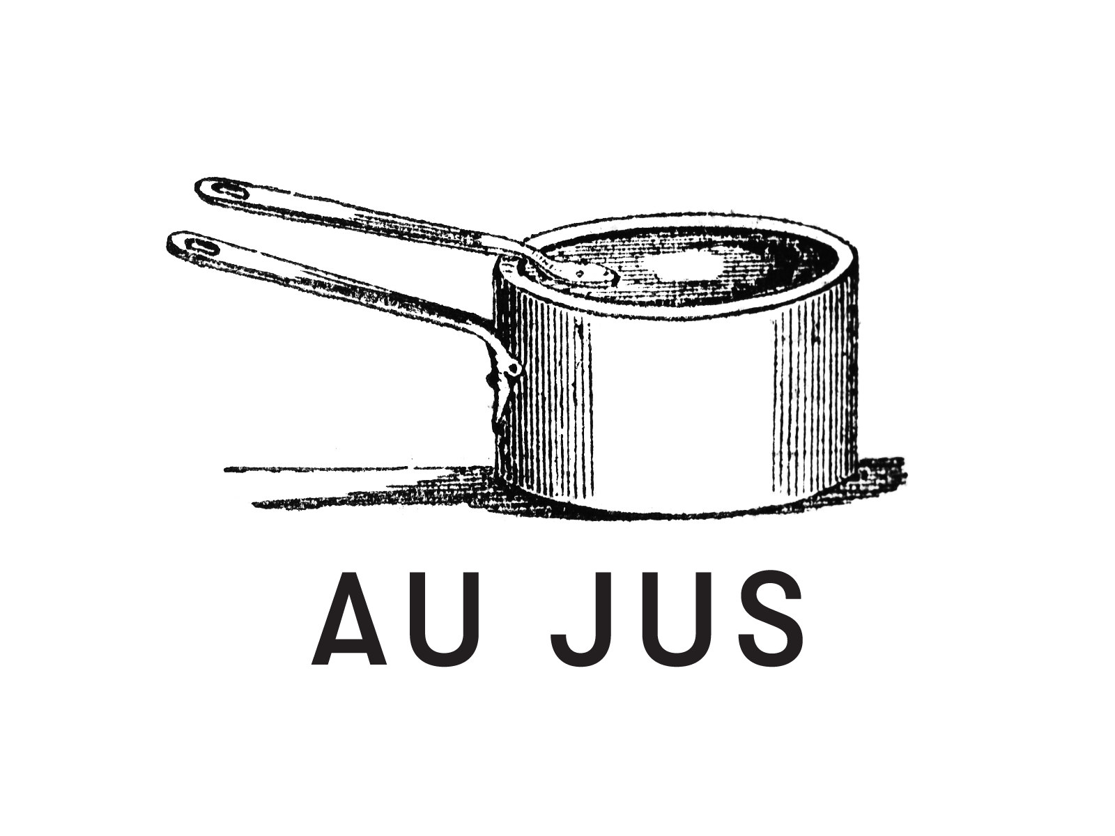
Visual identity
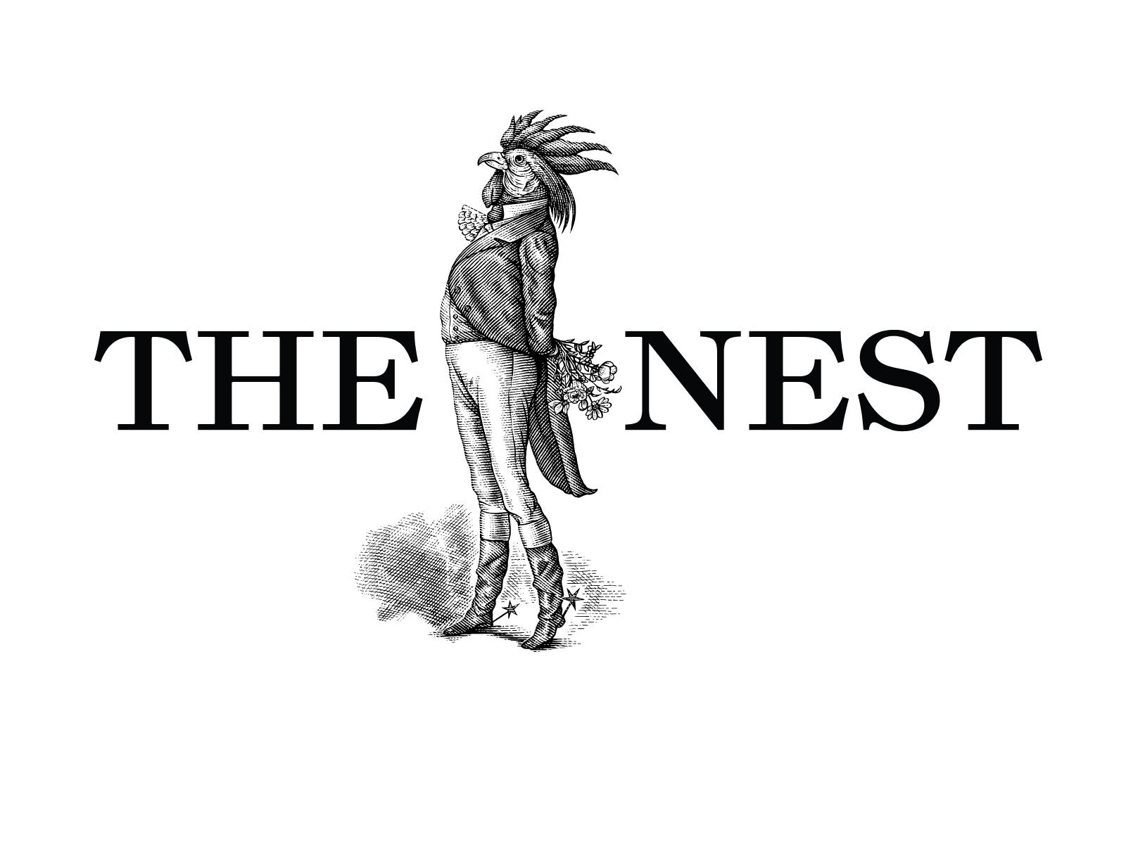
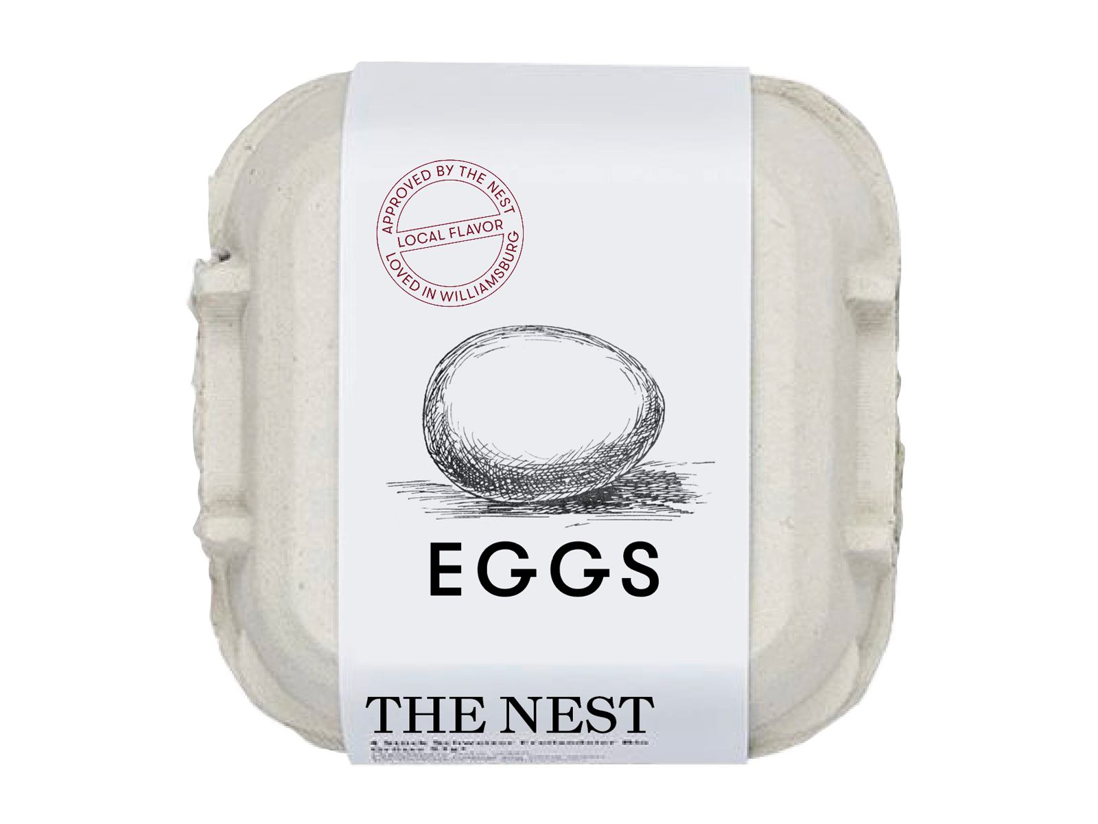
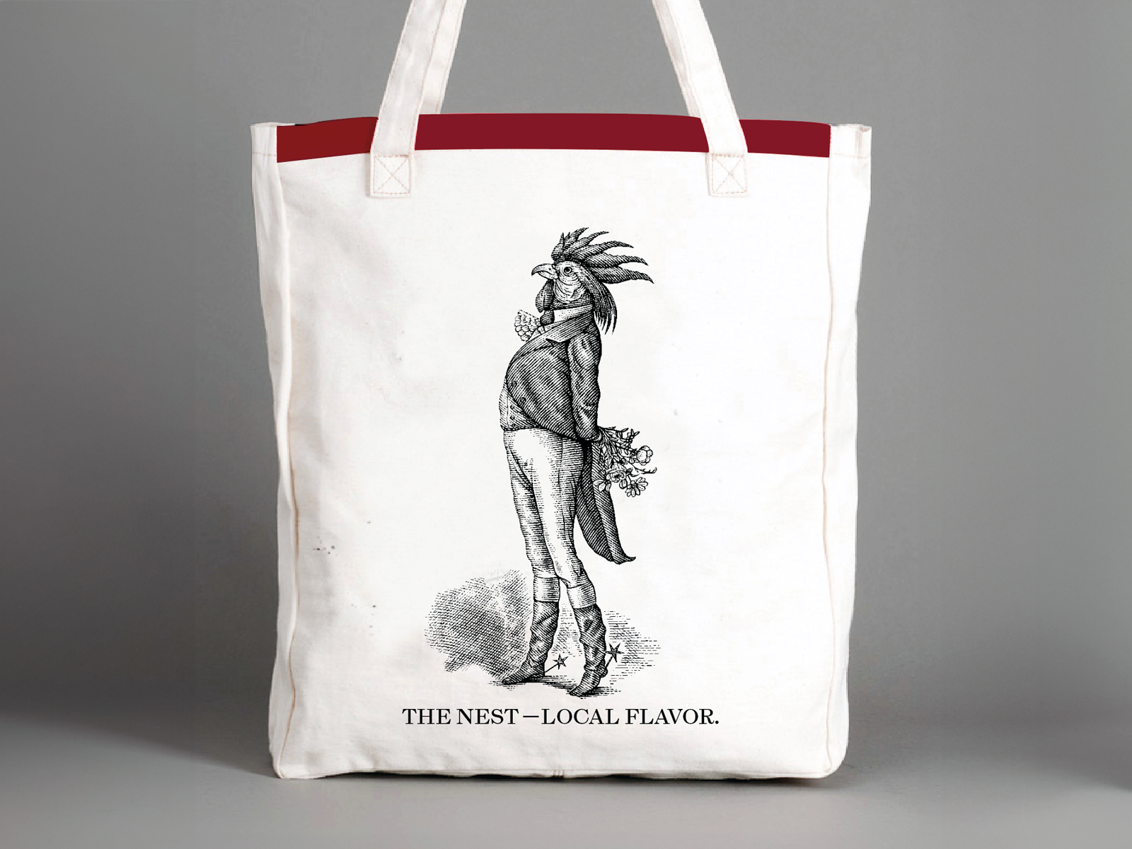
At the center of the identity is the rooster-man, a 19th‑century engraving we discovered in a British picture collection. The half‑man, half‑rooster figure radiates absurd confidence, embodying the brand’s character: humorous yet dignified, confident without reason. The engraving technique connects directly to the print traditions of Bodoni’s era, uniting illustration, type, and material under a shared craft lineage.
Typography balances heritage and warmth. Esperanza, inspired by stamped stoneware lettering from the 19th‑century Athens Pottery Works, brings utilitarian grace and authenticity. Bodoni 72 Oldstyle honors the precision and refinement of classical typography. GT Walsheim, drawn from mid‑century Swiss poster design, introduces contemporary clarity and approachability.
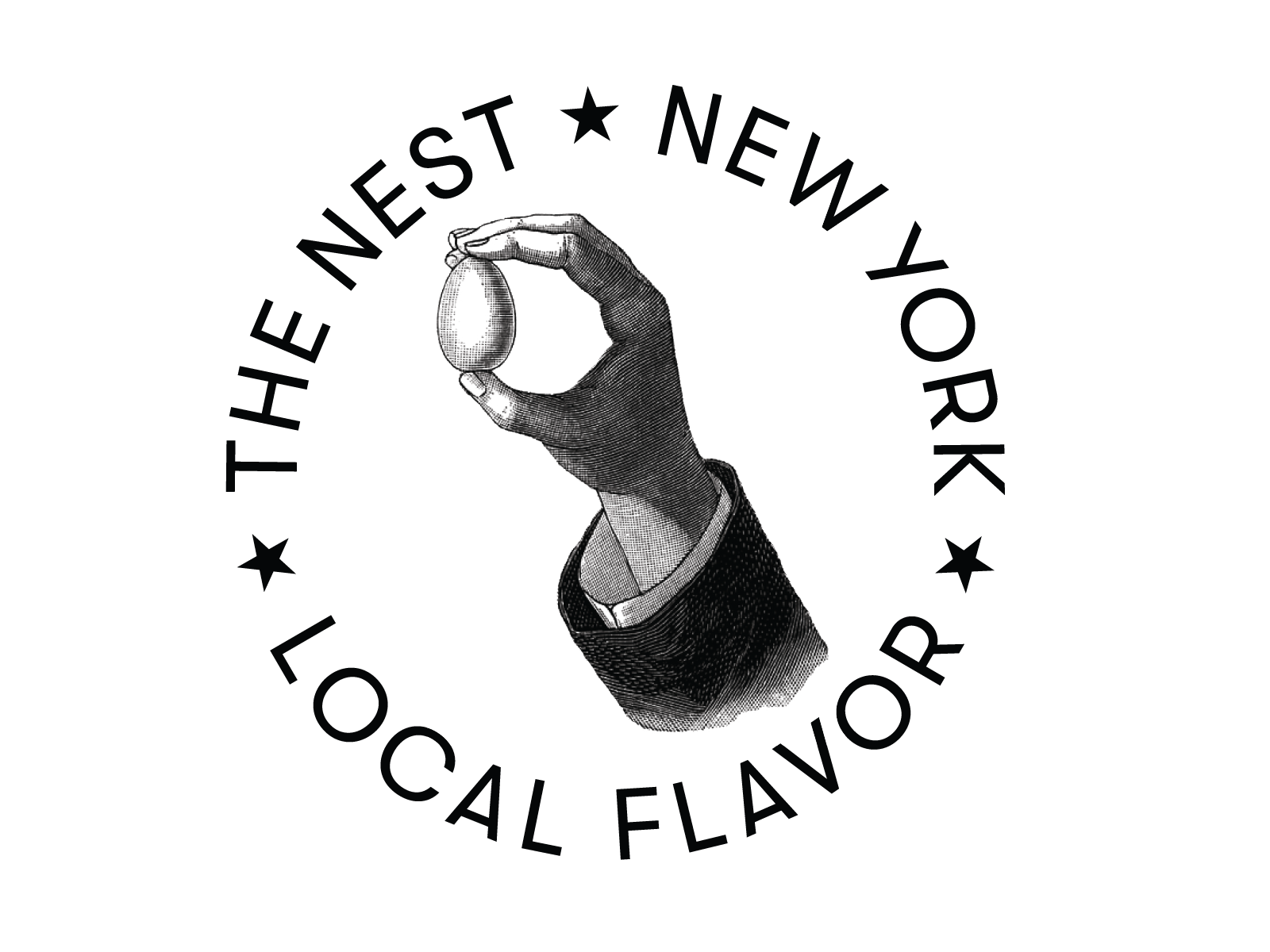
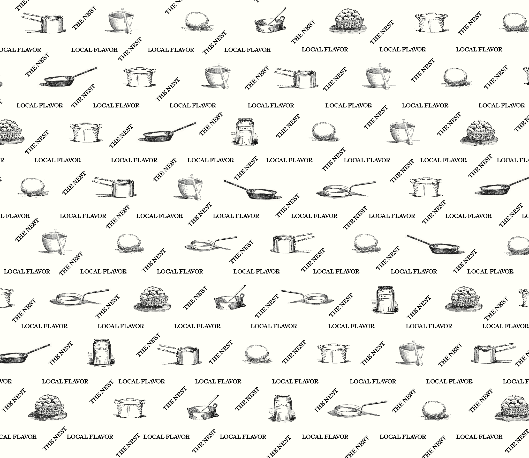
Color completes the system. Black grounds the type and line work; gold, yolk yellow, burgundy, and silkie white celebrate the egg as the brand’s central symbol. Yolk‑yellow stripes appear on awnings and packaging, while secondary hues drawn from heritage breed eggshells—buff, cream, and blue‑green—add quiet variation.
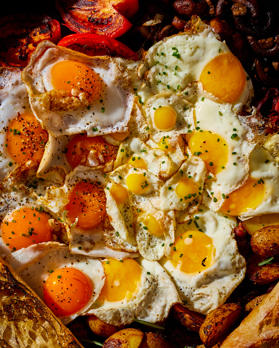
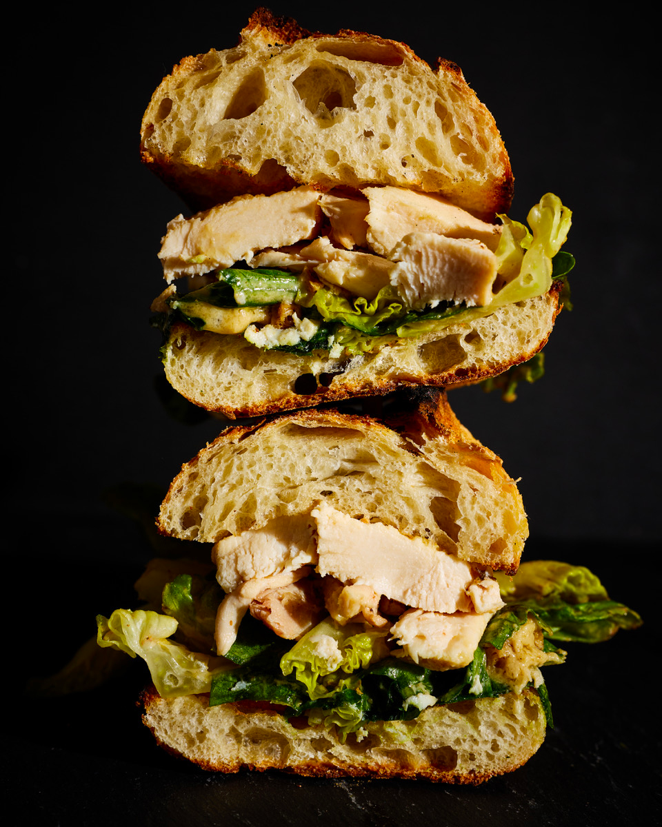
Art direction and experience
Photographer Johnny Miller captured the food and interiors with honesty and restraint, reflecting the same balance of craft and clarity that defines the concept.
Sourcing and preparation follow this philosophy. Poultry is pasture‑raised, antibiotic‑free, marinated for twenty‑four hours, and roasted instead of fried. Every operational detail supports one idea: integrity through process.