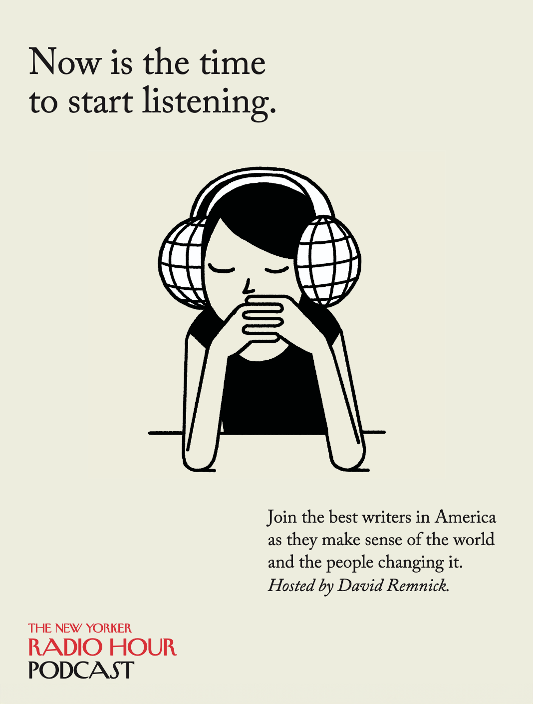
THE NEW YORKER MAGAZINE
Editorial precision as modern brand stewardship
As Design Director for editorial and consumer marketing at a major New York cultural institution, the mandate was clear: translate a century of excellence into contemporary touchpoints without compromising what made it singular. The work required holding two priorities at once, protecting a deeply established voice while extending it into campaigns, products, and experiences that felt unmistakably current.
Research as foundation
Just as earlier magazine work drew on traditions of field reporting and immersive documentation, this role depended on understanding The New Yorker as more than a publication. It functions as a daily record of New York’s conversation, from subway platforms and newsstands to offices and after-hours debates, and any extension that ignored that context risked feeling hollow. Eight years inside the institution allowed patterns to emerge: which covers became shorthand in culture, which artists defined its tone, and how its wit and rigor translated across changing media.
Product development
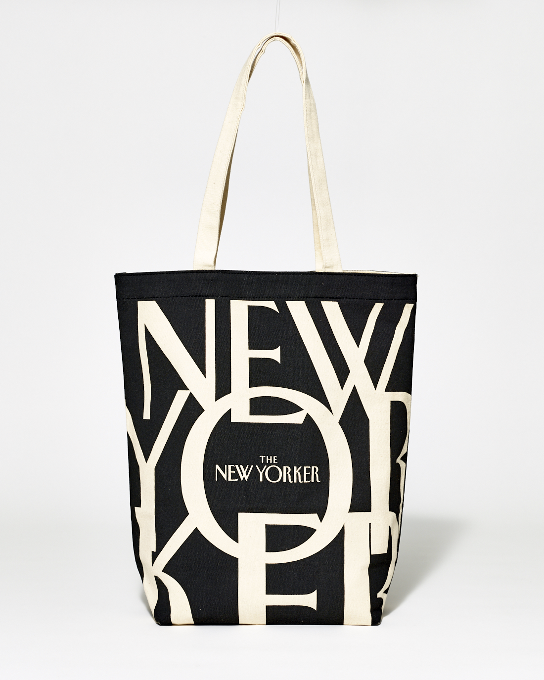
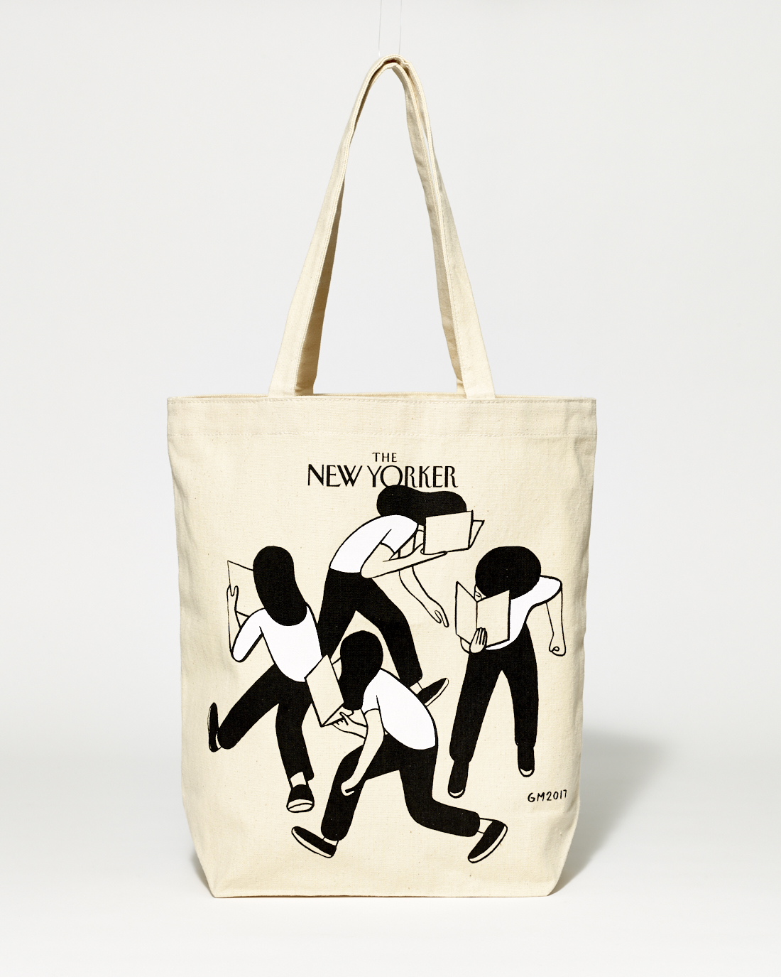
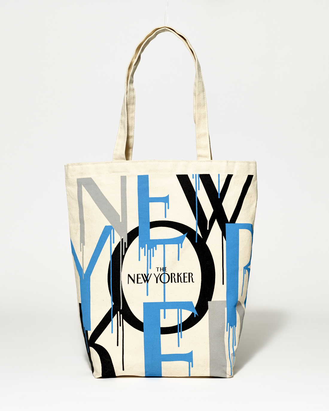
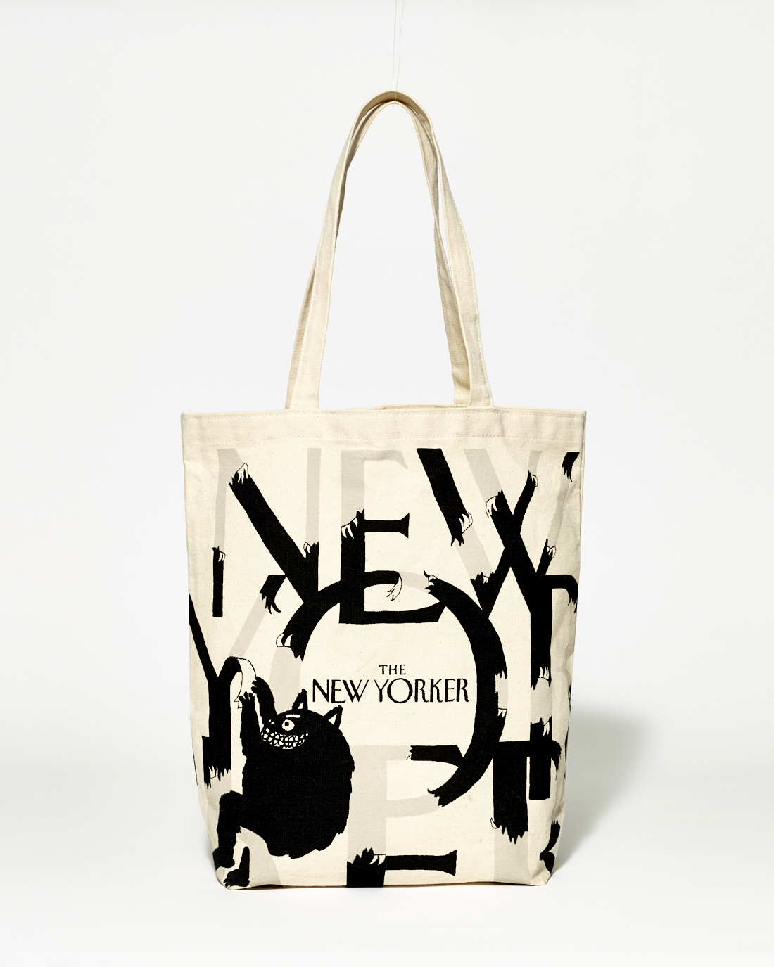
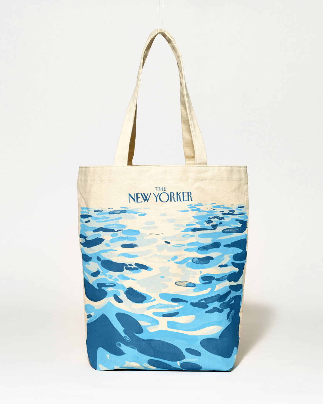
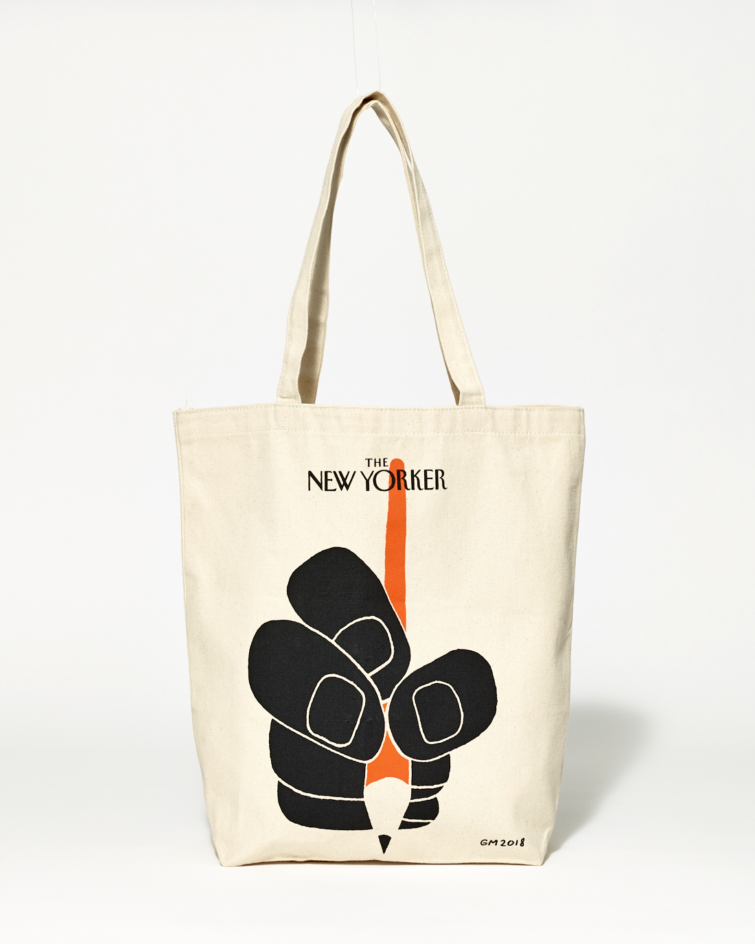
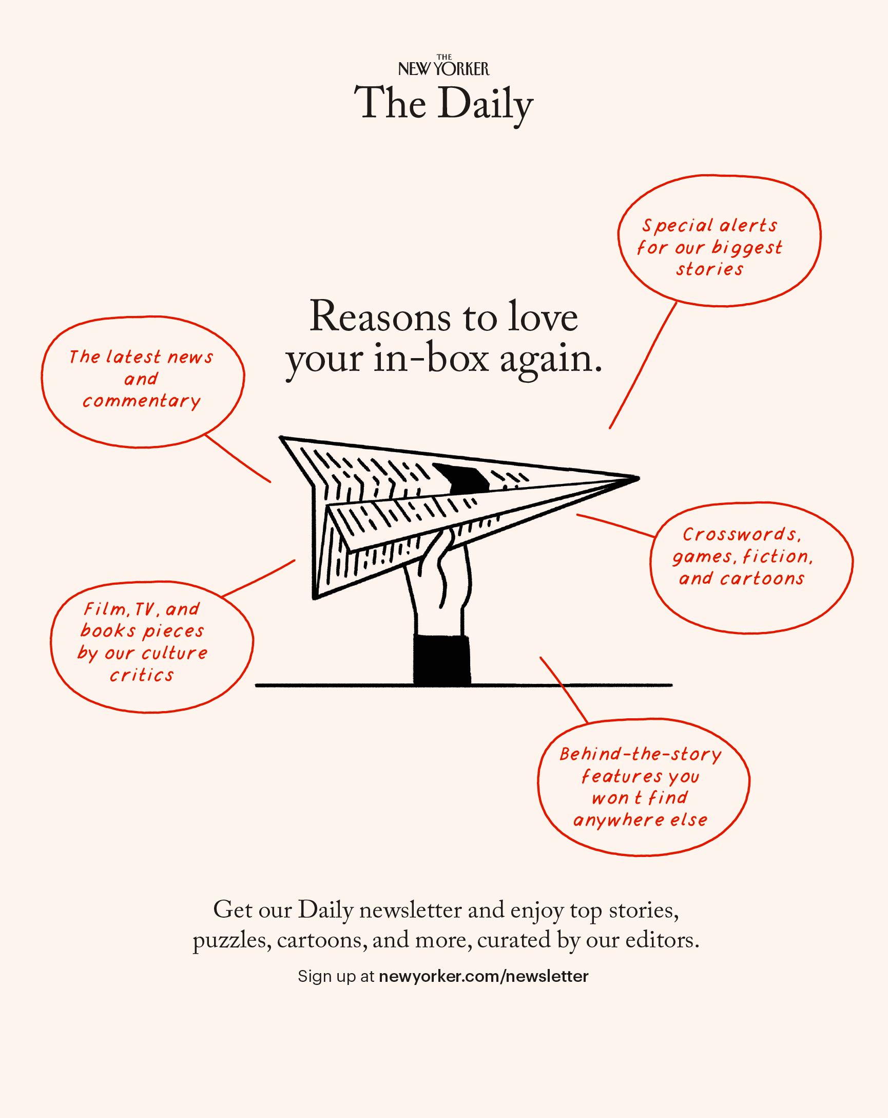
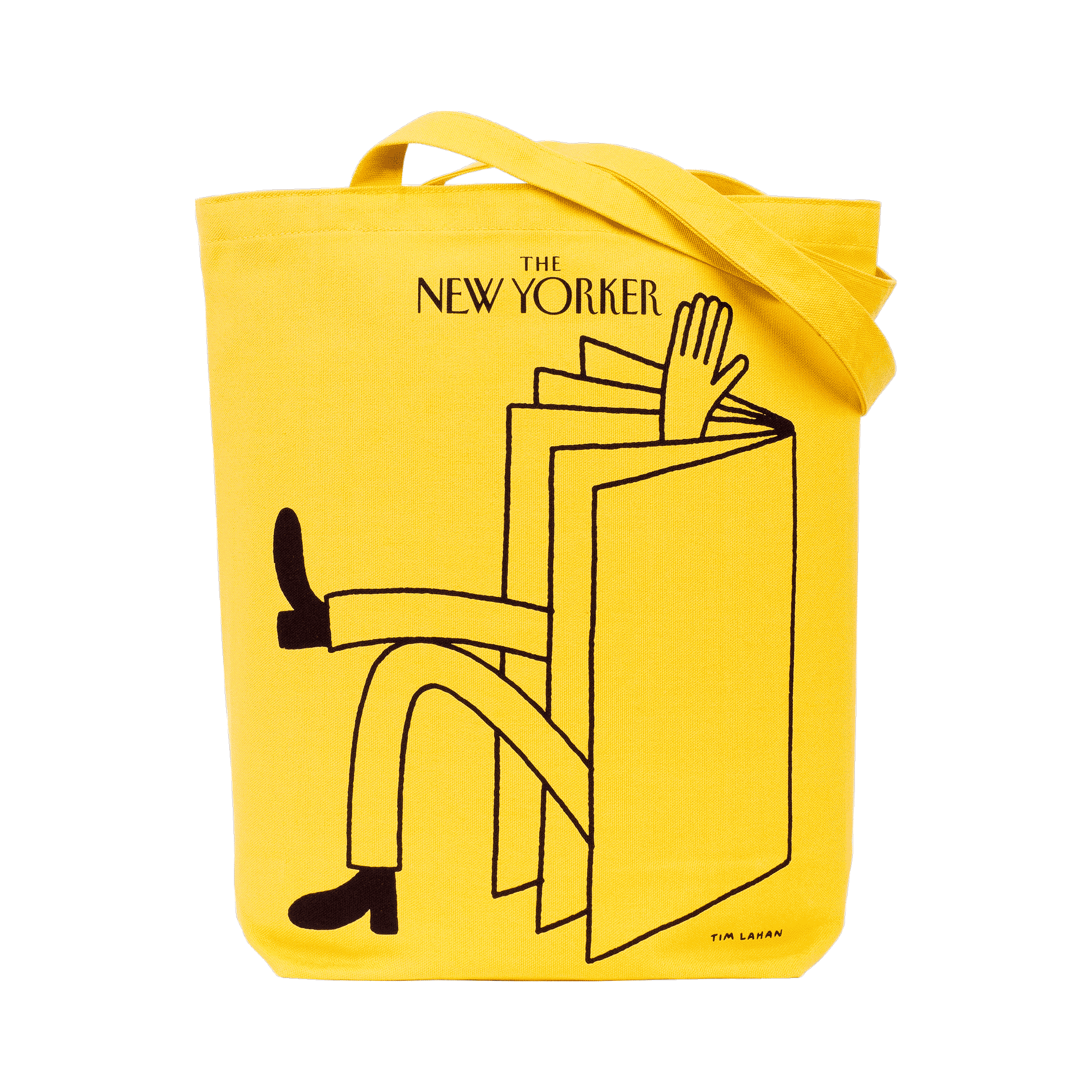
Within that framework, tote bags, apparel, and everyday objects became extensions of the magazine’s character rather than promotional add‑ons. The now‑iconic subscriber tote, for example, succeeded because it behaved less like advertising and more like a quiet membership signal, something people chose as part of their daily uniform. Each product required close collaboration among illustrators, production teams, editors, and marketers so that materials, typography, and tone all aligned with the underlying editorial values.
The Centennial
For the magazine’s one‑hundredth anniversary in 2025, the work returned to its truest terroir: New York City and the visual language that has chronicled it for a century. Eustace Tilley, the original dandy created by Rea Irvin, was reinterpreted for the occasion by Christoph Niemann, whose updated masthead and character treatment honored the hand‑drawn lineage while making subtle adjustments for contemporary reproduction. New products and campaigns built around this identity allowed readers to carry a piece of that history into daily life without flattening it into nostalgia.
Cross‑disciplinary fluency
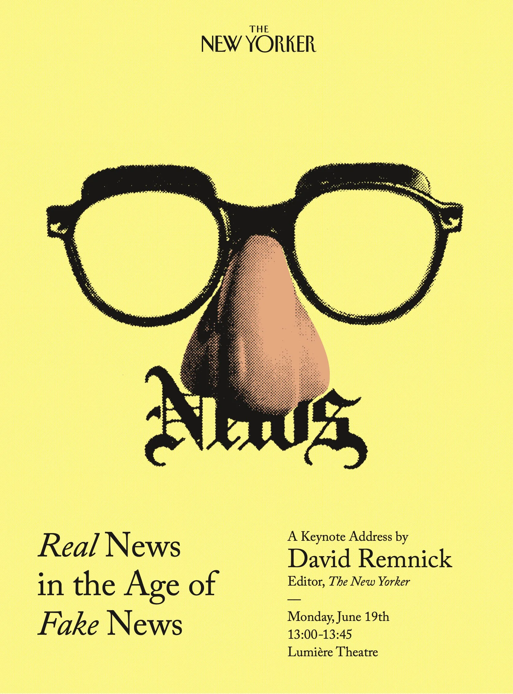
The role bridged editorial design, festival and event branding, advertising, and product development, with each discipline informing the others. Decisions about a festival mark or anniversary wordmark were inseparable from choices about how a cover would live on a tote, in a digital package, or within a physical exhibition. Effective stewardship depended on operational fluency—understanding schedules, production constraints, and sales goals—matched with editorial sensitivity to language, humor, and nuance.
What this taught
Sustaining a legacy brand demands time, immersion, and context; no mood board can substitute for years spent inside its systems, language, and rituals. Living with the institution long enough to see ideas tested in public clarified a central lesson for Field Office: enduring identities come from continuity of values, not constant reinvention, and the most modern work is often the work that understands its own history most clearly.